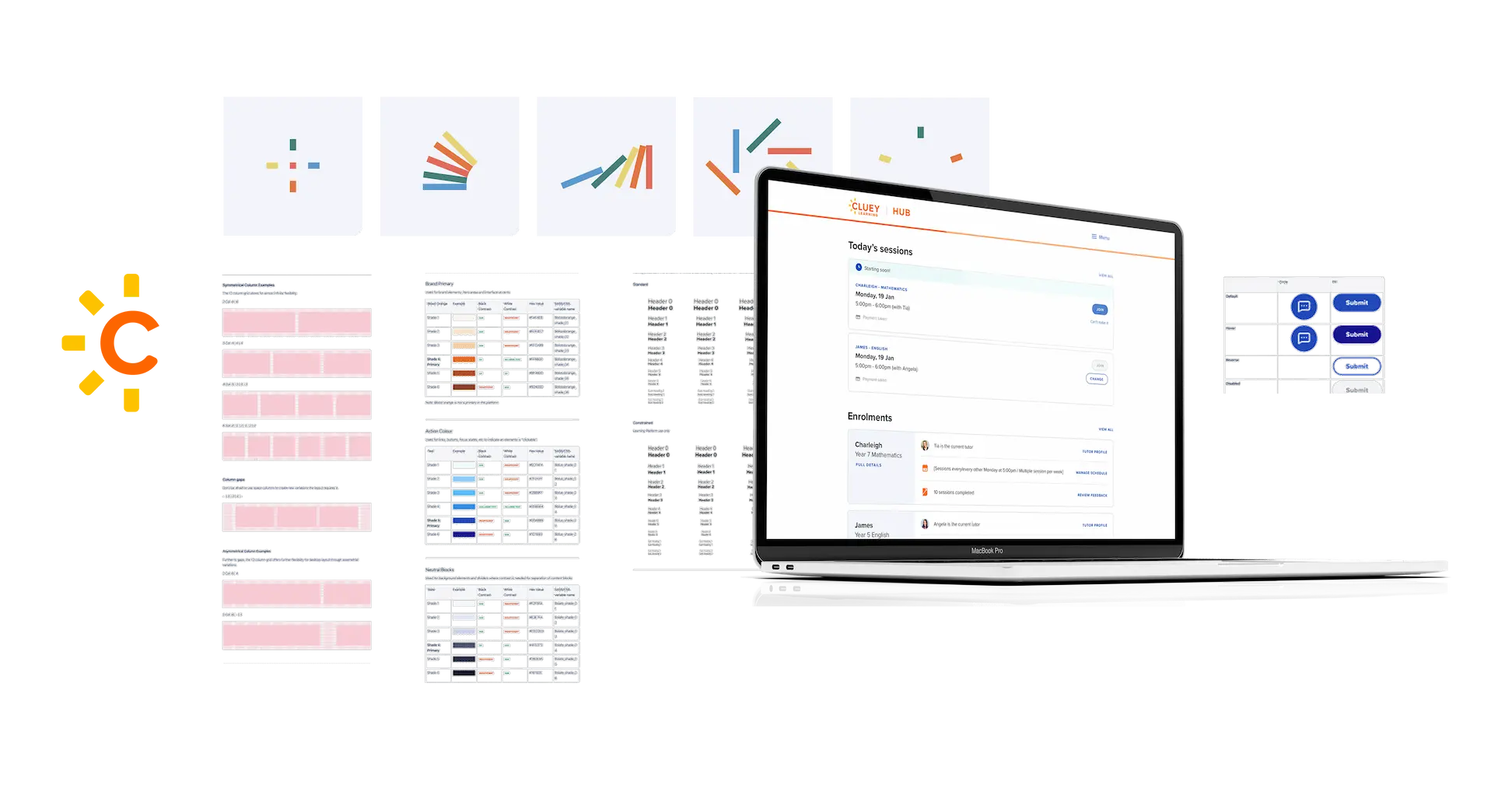
Cluey Bricks Design System
Consistent, efficient and effective design fragments which make up the experiences to ensure Cluey's product design principles are made manifest.
Employer: Cluey LearningRole: Product Design Lead
Purpose
The Cluey Bricks Design System documented rules and guidelines to set a new direction for all digital properties and touch points which better reflected Cluey's personality. Not just to standardise interface artefacts but to ensure all product experiences felt "Cluey". The systems flexibility enabled the creation of new components and flows efficiently, but also ensured digital experiences innately adhered to the guiding design principles.
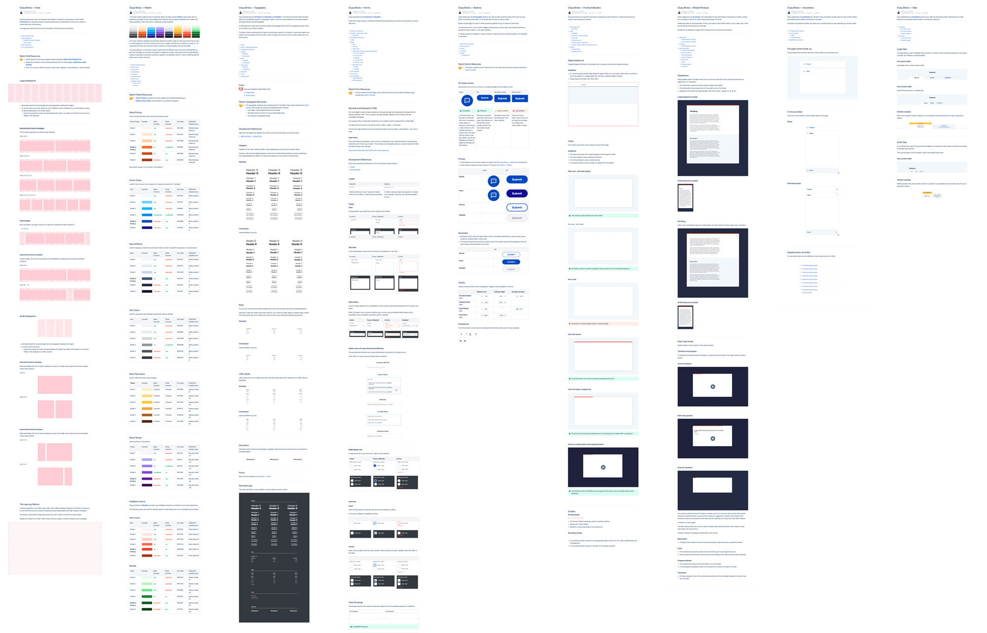
Documenting the design system
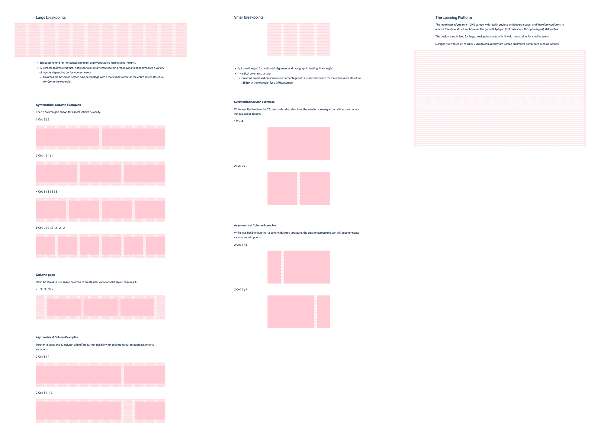
Design systems enable scalable design, but they themselves must scale. Clear documentation gave designers and developers both rules to follow and the rationale behind them. Implementing the system through Sketch Libraries and Symbols ensured efficiency, consistency across teams, and easier updates.
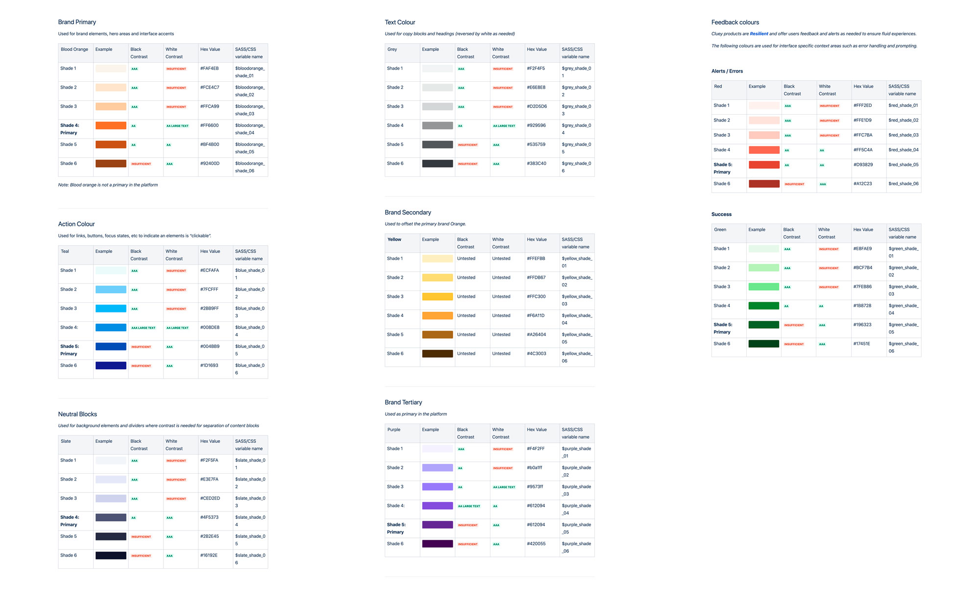
Palette
The Cluey Product palette serves two important needs; the high contrast Poppin' colours align with our experience principles but also acknowledge that customers have varying accessibility (a11y) needs, and may be partially or fully colour blind or otherwise visually impaired.
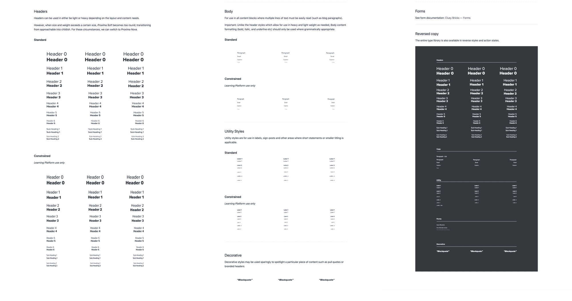
Typography
Cluey experiences are Acuminate, Cluey Design PrinciplesReceptive and Cluey Design PrinciplesResilient. The Proxima font family (Soft and Nova) allows for the flexibility required for typography variety, accommodating everything from headlines to micro-copy without affecting legibility.
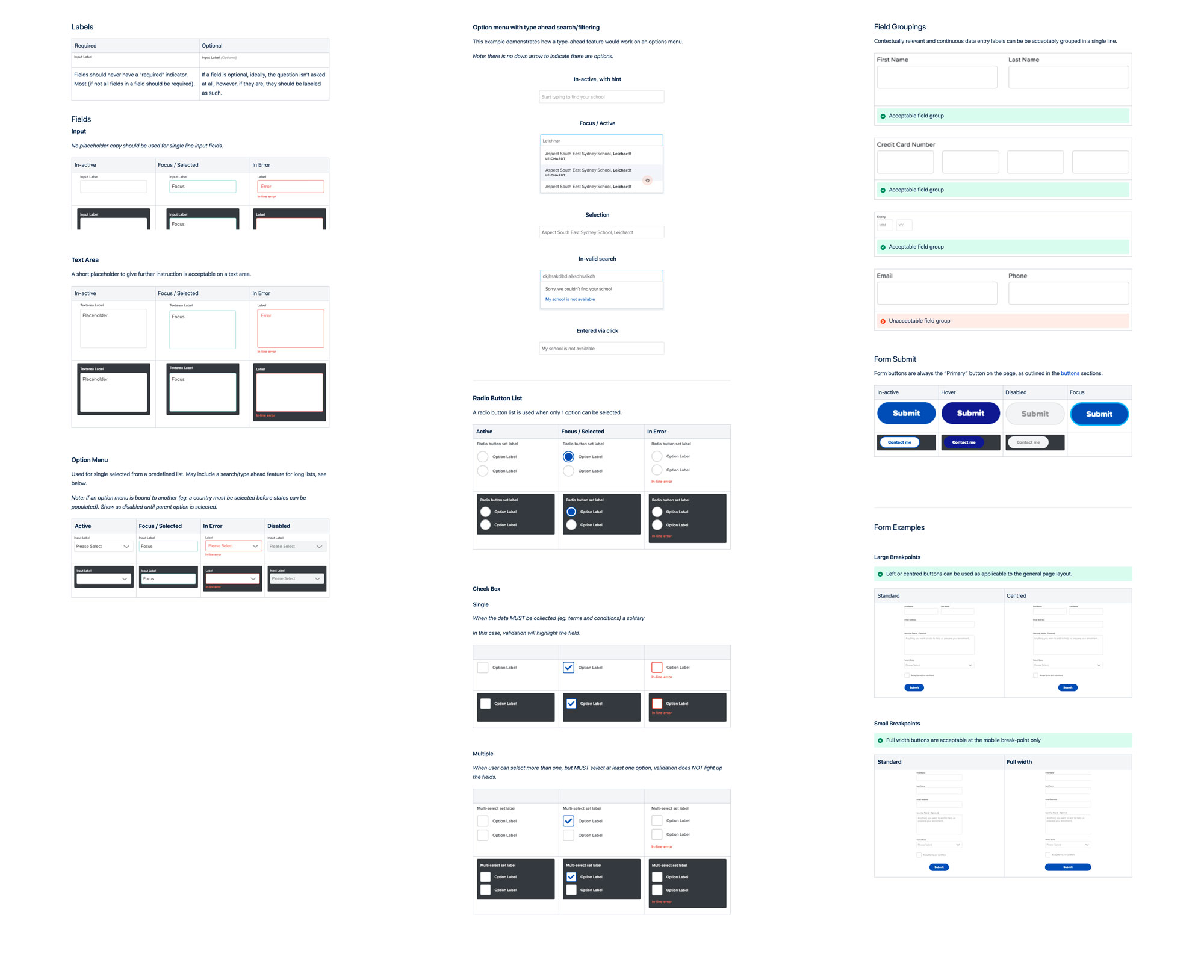
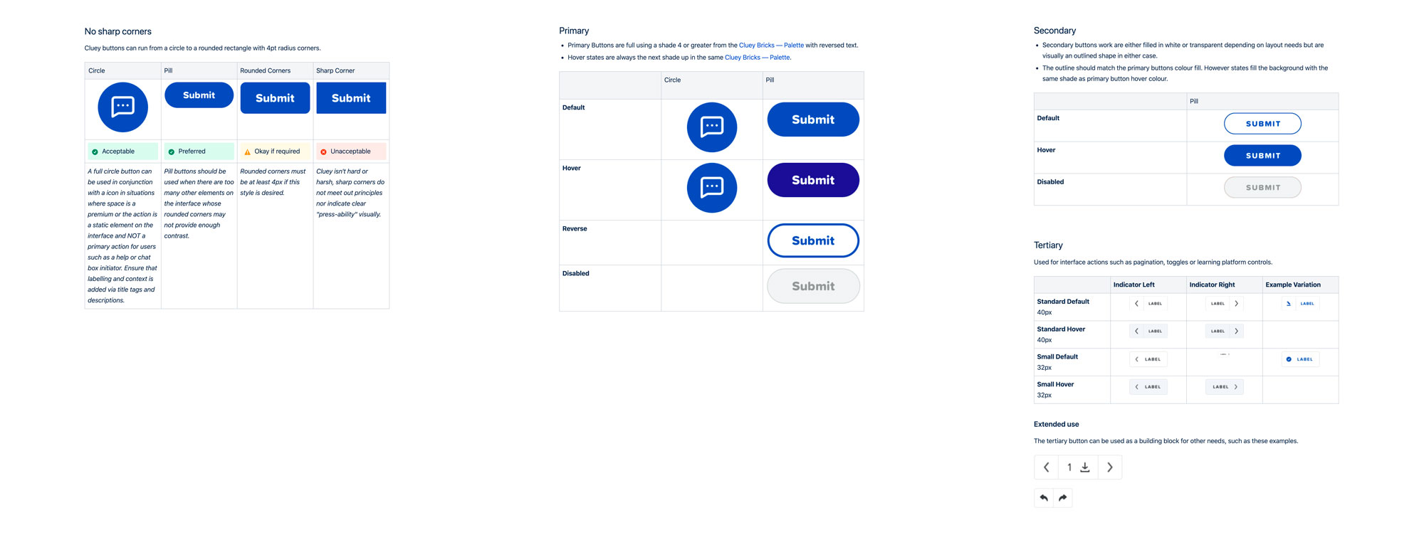
Forms and Buttons
Cluey forms make it easy to understand the data being requested and minimise the potential for incorrect data entry. Cluey experiences are Encouraging. Buttons are used to action important parts of the user’s journey, either in submitting information, or continuing their journey via calls to action.
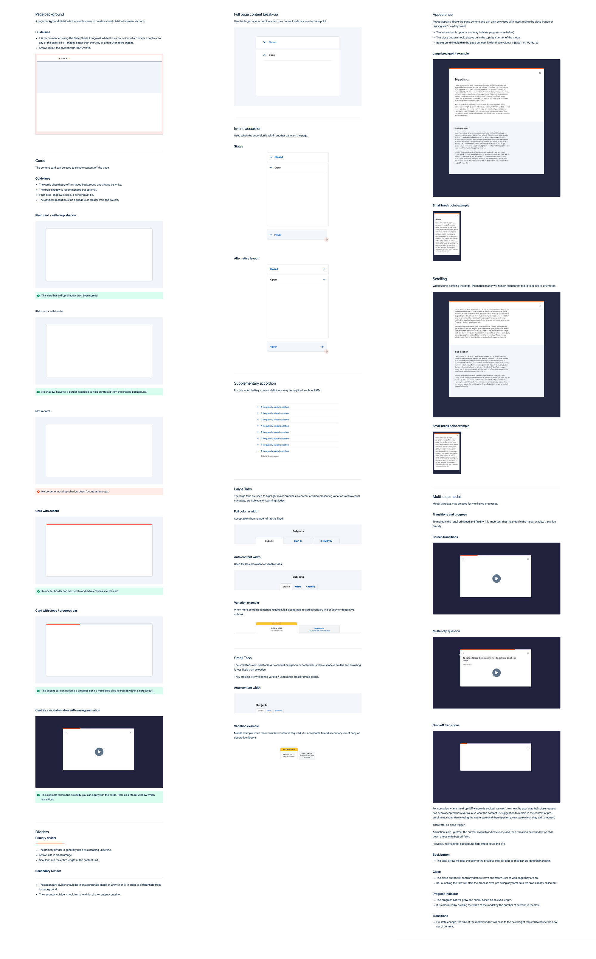
Headers, Frames, Tabs, Accordions and Modals
Giving prominence to important information and applying content hierarchy in responsive layouts can require visual framing and dividing. Panels, tabs, accodions and modal windows in various contexts allow for experiences to remain Acuminate and the use of tabs can help filter content, allowing users to make decisions or and explore options before committing to a decision.
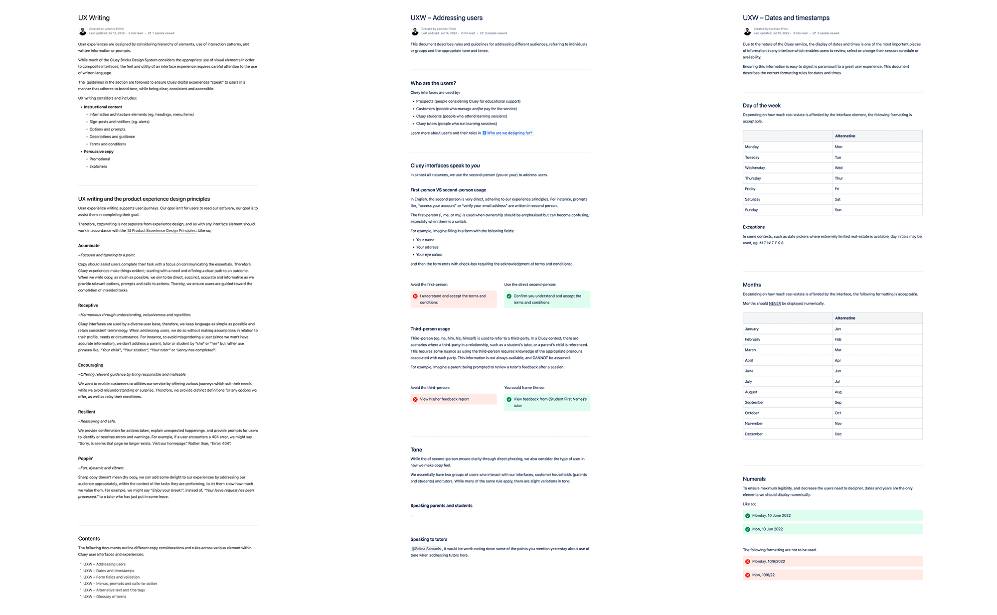
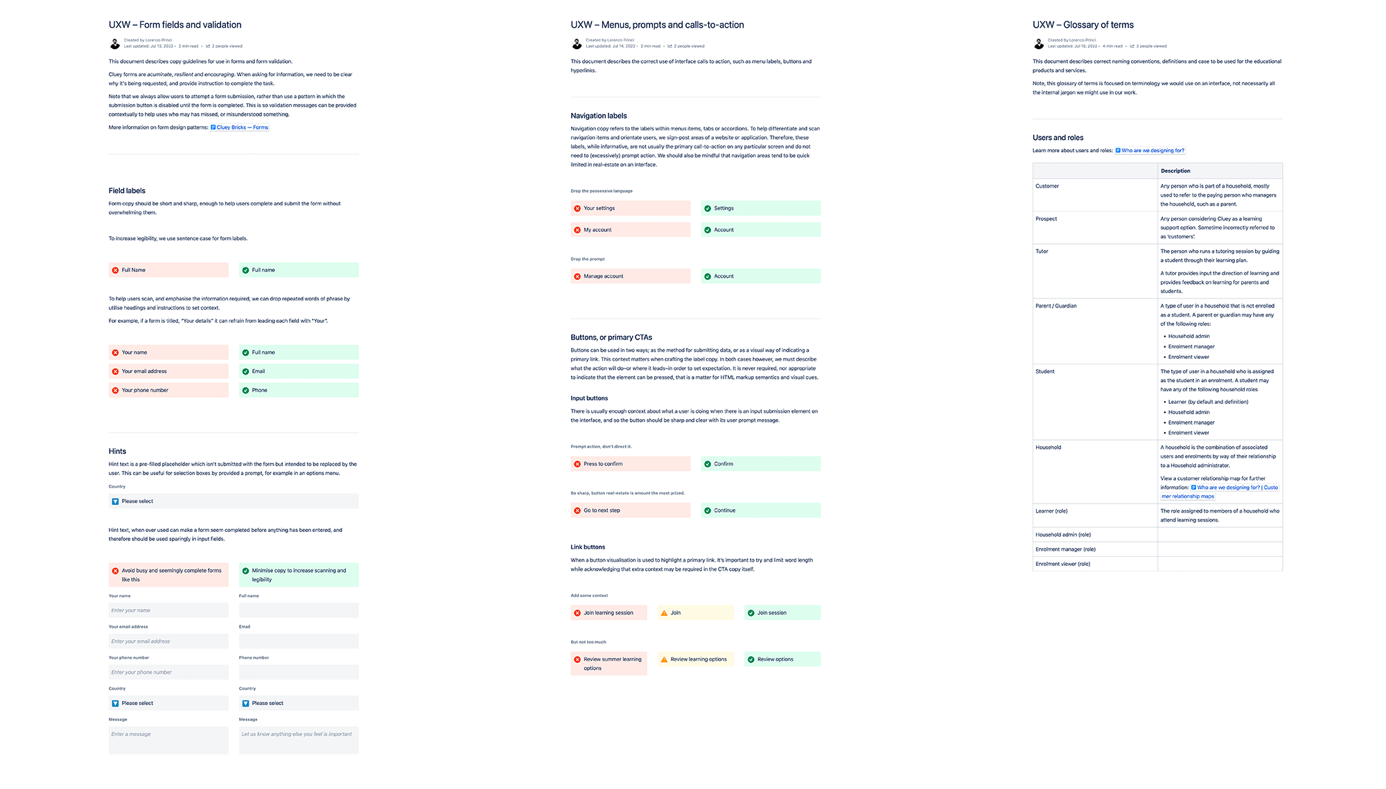
UX Writing
Consistancy and clarity within the use of language on an interface is just as important as its visual language. Therefore, a comprehensive guide for copywriting across Cluey digital touch-points accompanied the design system.
Lorenzo Princi
Software design leader—
Product strategy and experience