The design process
This section details the process of ideation, research, design and delivery of the new Cluey Learning website.
The product merchandising problem
Besides targeting parents of school going children, we acknowledged that we didn't really understand the problem or the "job" they were seeking to address. We recognised that solely facilitating a, "help me find a tutor" position was based on a shallow assumption that customers had already bought into our solution or that tutoring was the solution. It is also a position which doesn't fully highlight the company's point of difference when compared to tutor marketplaces.
Being in the problem definition phase, we proceeded ideating how we might stimulate conversation with Mums of school going children to uncover and unpack the problems they face. We looked at two distinct directions: exploration and guidance. The manifestation of these directions was two simple prototypes: Guide and Explore.
Guide
The prototype for the Guide concept held information back until customers completed a questionnaire, which produced a suggested learning program.
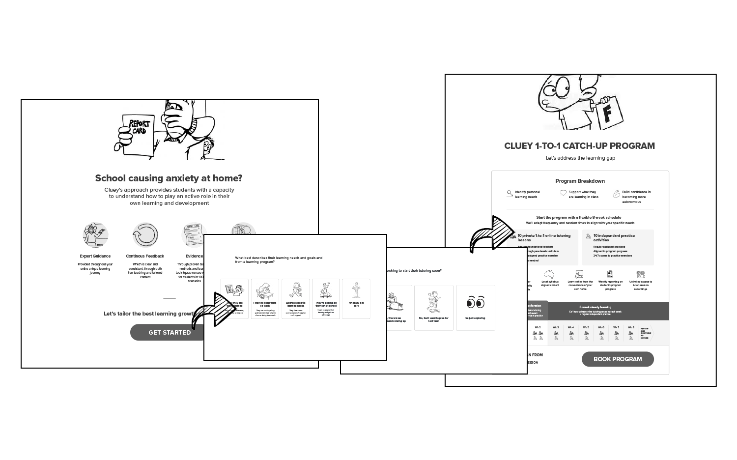 The low-fidelity Guide prototype funnelled users from a home screen through a questionnaire and ended on a program recommendation
Explore
The other, prototype encouraged exploration. It lay out all of Cluey's different services like a menu, offering much more detail upfront.
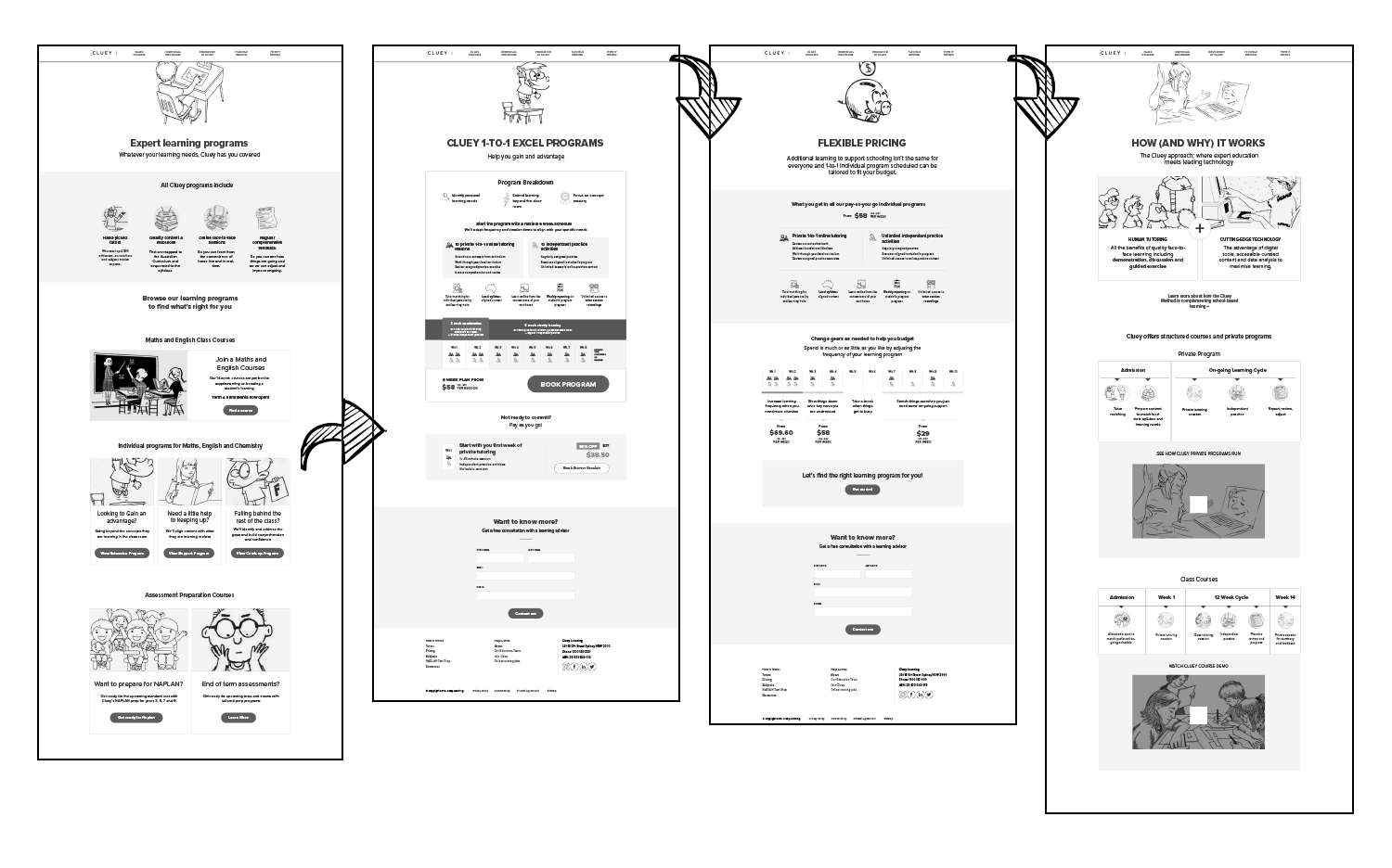 The low-fidelity Explore prototype included a full menu and prompted much more user-led action
What did we learn?
After interviewing eight Mums, we identified the problem with Cluey's existing product merchandising and discovery approach. In trying to reach everyone, the offering was presented broadly and customers were left to figure out whether if it was suitable for them or not. Moreover, imagery and language could quickly put off customers. For example, including a simple "Chemistry" signal suggested to parents of younger students that Cluey wasn't age-suitable for their children.
We also discovered "the job"
Despite different student learning needs and backgrounds, Mums who were interviewed shared some common experiences. Key themes that emerged from included great burdens of responsibility around the education of their children, and running the household schedule. Mum trust established institutions and believe their children would “do the right thing” when it comes to school and homework. However, when those fail, Mums feel blindsided and at fault for not realising the problems sooner. This causes fear that they’re failing as parents. When they seek help from this point on, their uncertainty about how to proceed adds further pressure to the decision-making process.
Thus, the job we needed to solve was to help customers feel confident making a decision about their child's education.
I turned these insights into design principles to help the design refinement phase.
- Acknowledge: Present all products and services in the context of the customer's needs, rather than broadly.
- Accommodate: Ensure the flexiblity of products and services is signalled and that the programs are easy to explain to other members of the family, given that education support adds to an already busy family dynamic.
- Assure: Clearly signal Cluey's expertise in education, as well as how it applies to the customer's context.
- Articulate: Succintly position a complex product with a lot of detail.
The design challenge
Guided by the principles above, the design challenge was to answer two key customer questions simultaneously:
- What is it?
- Is it for me?
Traditionally, Cluey Learning limited its messaging to broad statements such as, "English, Maths and Chemistry tutoring for students in year 2 to 12". With the insights from our research, we wanted to minimise assumptions and ambiguity for customers. The website experience was designed completely around funnelling customers through a series of interests to a contextually relevant solution, offering the guidence they needed.
The website design essentially pose two key questions:
- "Who are you literally?" (Essentially, what school level and year is the child in) to present the appropriate visual style and language;
- "Who are you figuratively?" To recommend the right learning program based on theri level of need and learning goals.
As customers drilled down into their school level and area of interest, all the videos, visuals, copy and tone of voice appeared accordingly. This helped frame the features and benefits of Cluey Learning to each specific use case and circumstance.
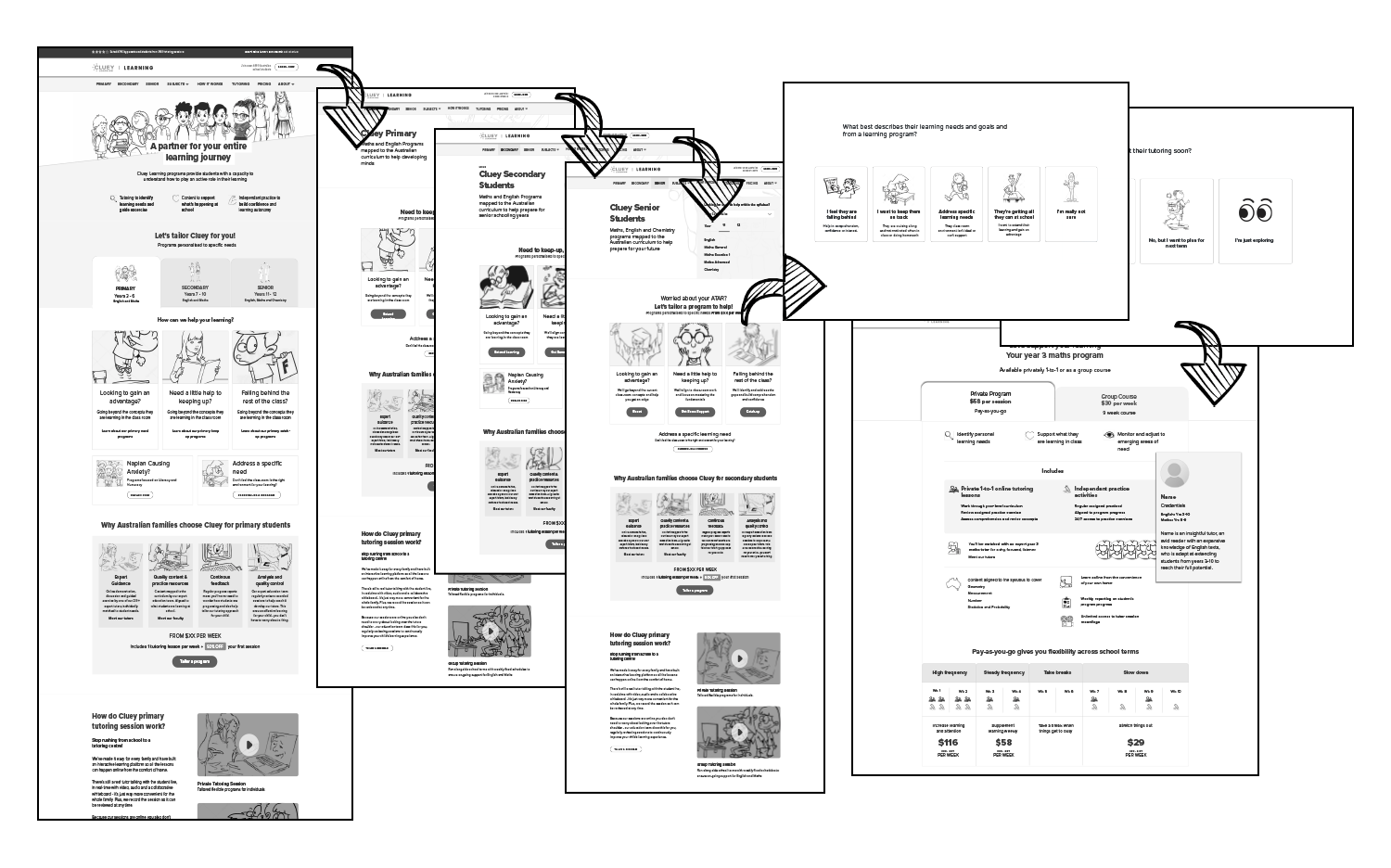 Cluey Learning website wireframes
Validating the approach
A robust, branded prototype of the wireframes was produced for final user testing in December 2019. Research interviews were set up to understand if the flow helped frame the product for customers and whether the new branding direction resonated with them. The question we needed to answer was: Would Mums feel confident choosing Cluey as a solution to their child's education support needs?
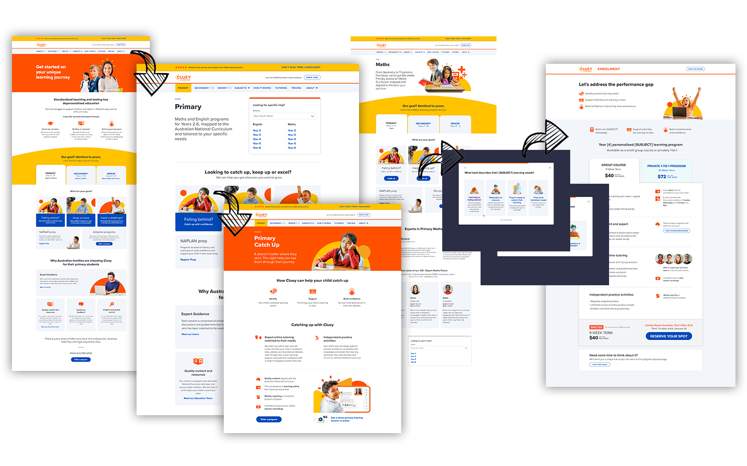 The first version of a new website
The takeaway
We were pleased with observing the way Mums self-selected their way through the journey when they only ever saw Cluey positioned for their child's year level and specific needs. However, we also noted some instances of Mums quickly losing confidence when assets presented the wrong message or an image, presented a child of the wrong age. While the concept was proven sound, we refined things further.
Designing for delivery
After adding some finesse, I completed the full, finalised site. It included the main user journey, peripheral business required pages and purchase flow variables, human resource and legal pages, as seen on the site map.
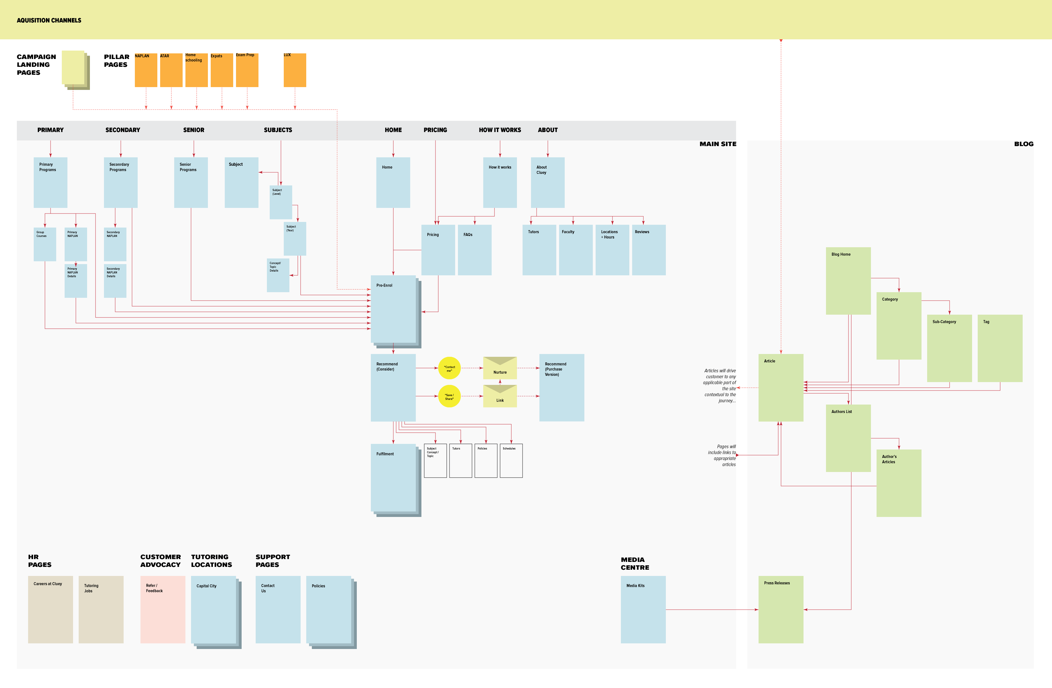 Aquisition paths and site flow
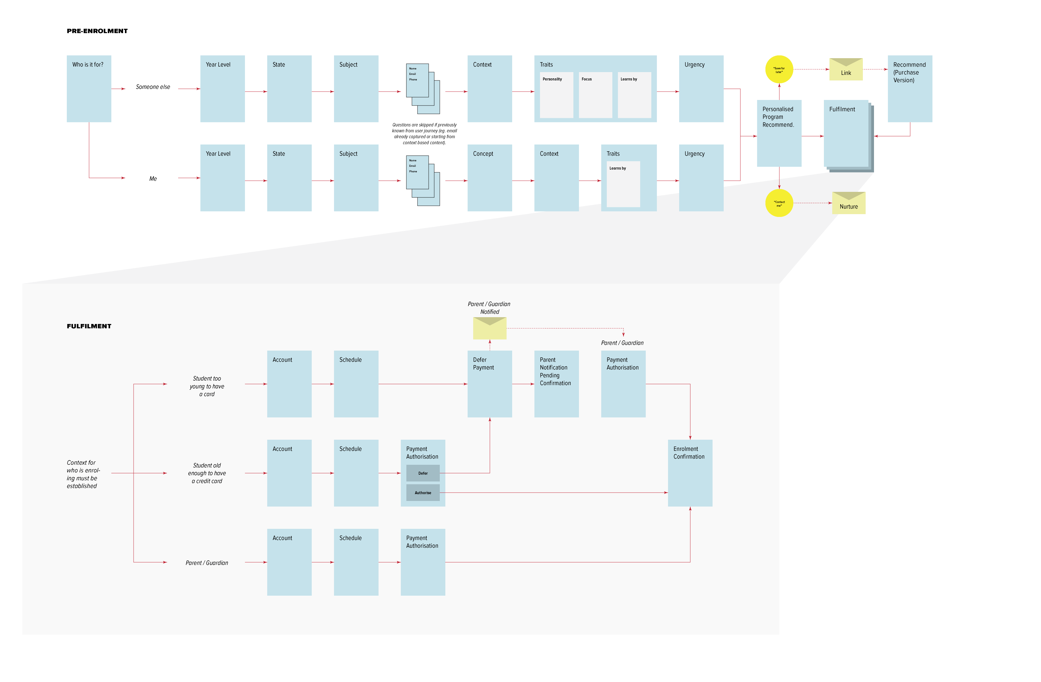 Fulfillment flow
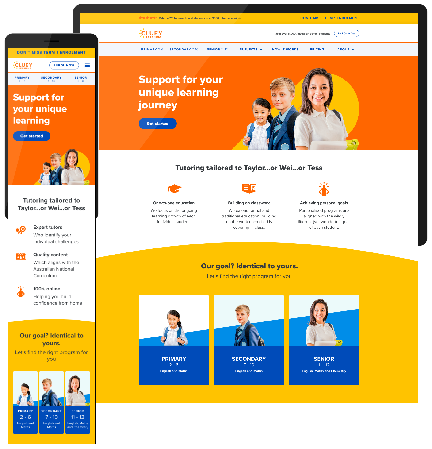 Cluey Learning Home
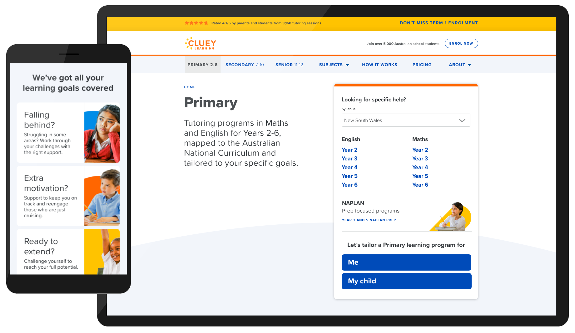 Primary School Years Landing
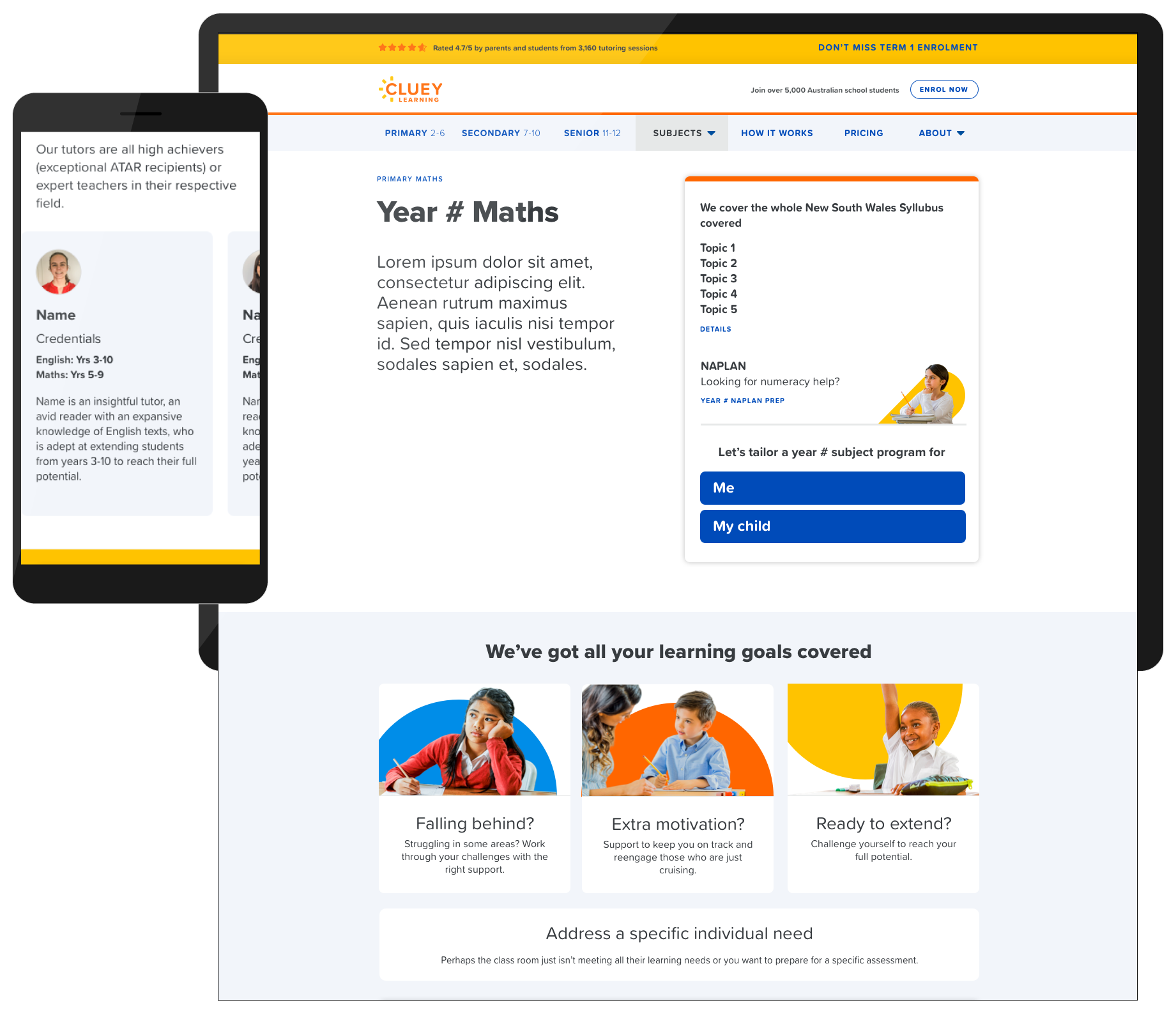 Primary Maths Year
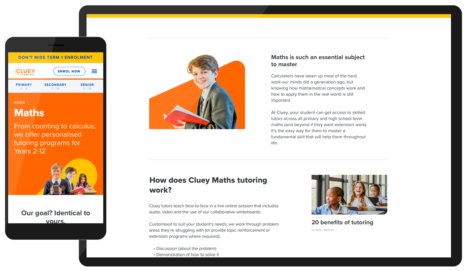 Maths Landing
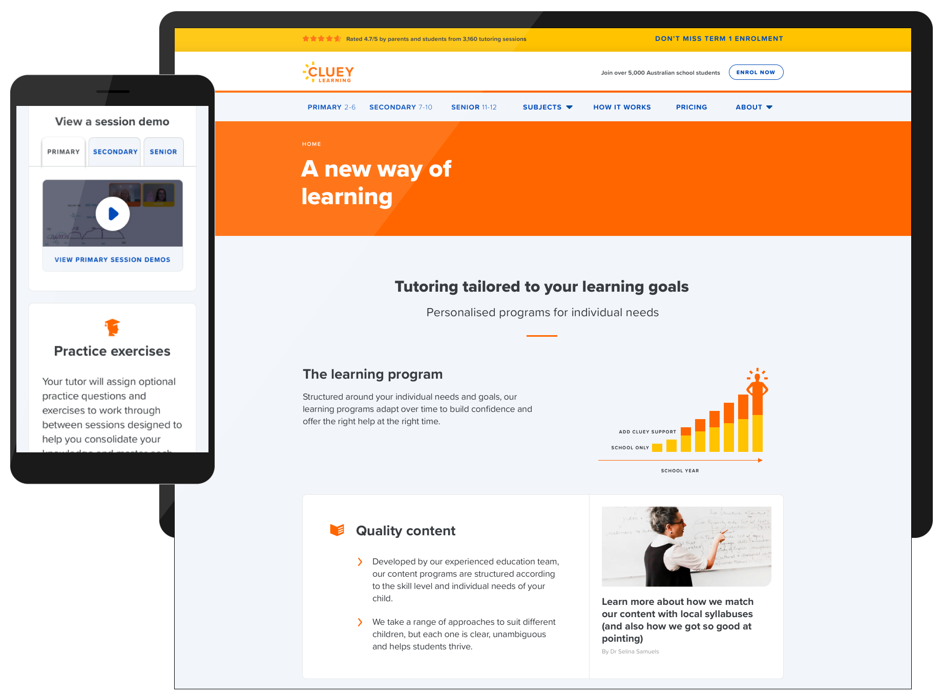 How It Works Page
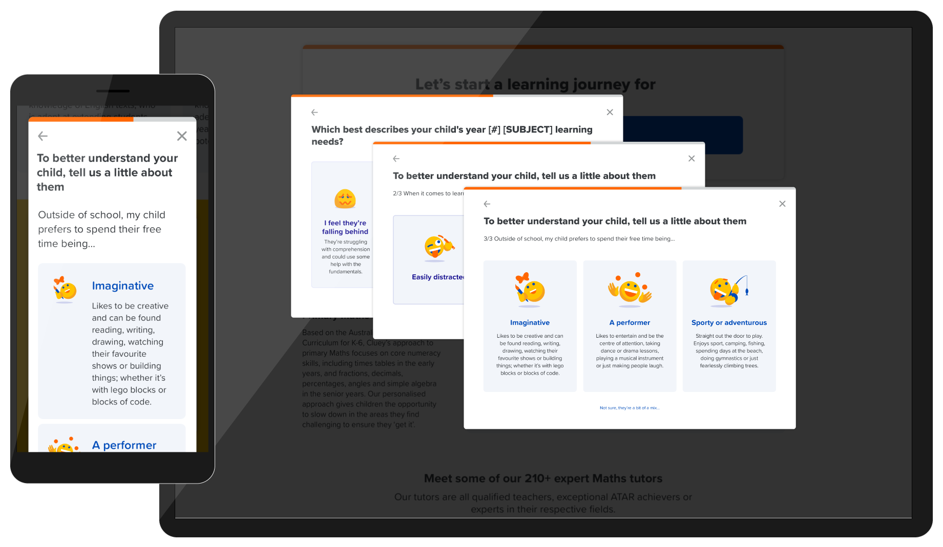 Pre-enrolment Questionnaire
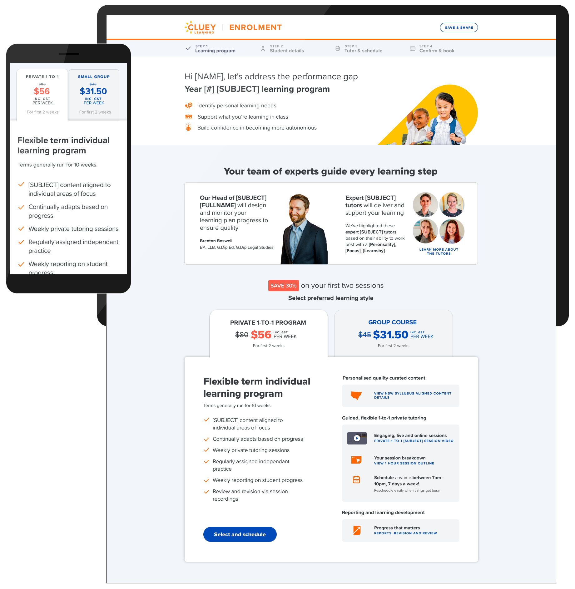 Contextual Learning Program Recommendation
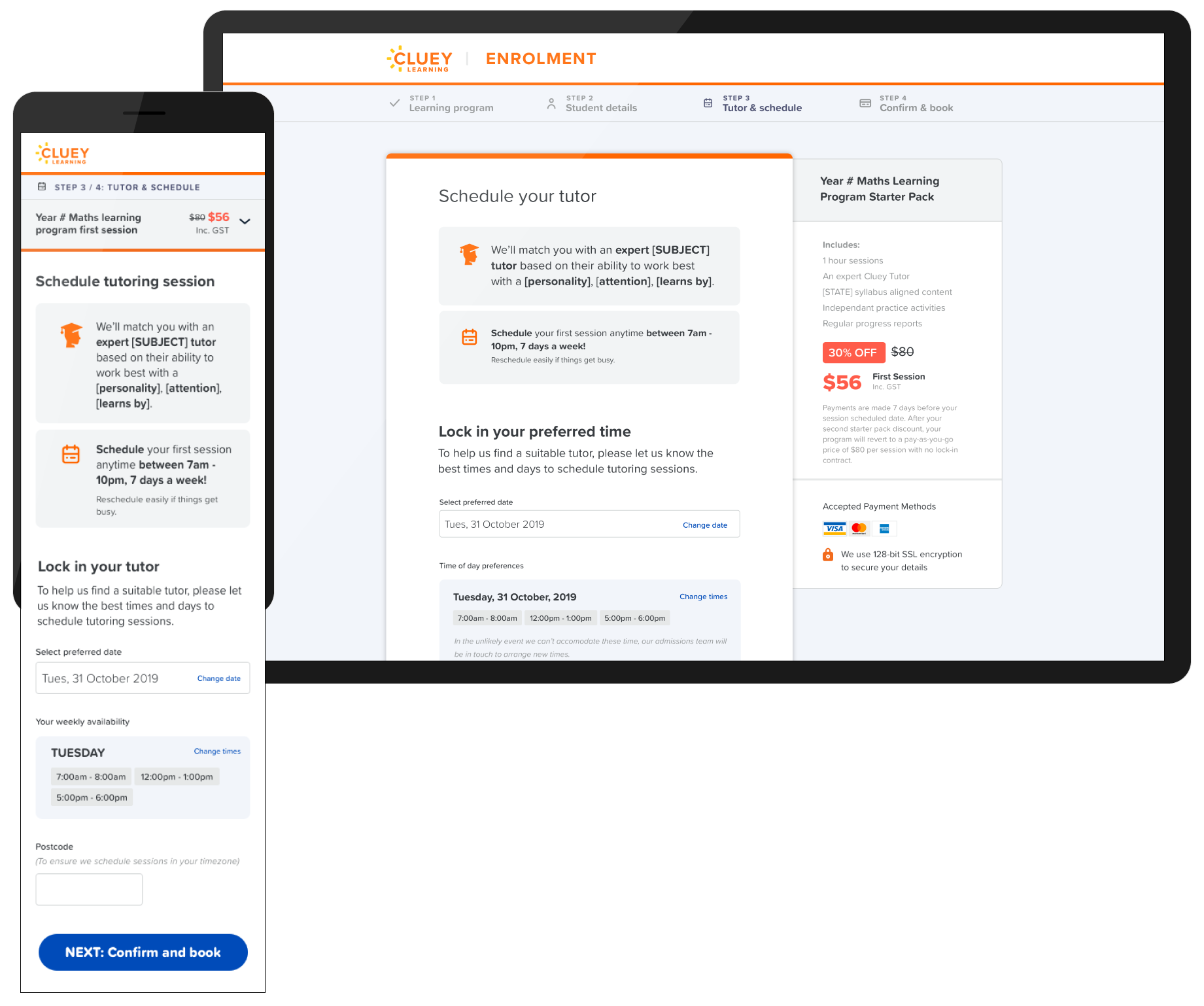 Booking Flow - Scheduling