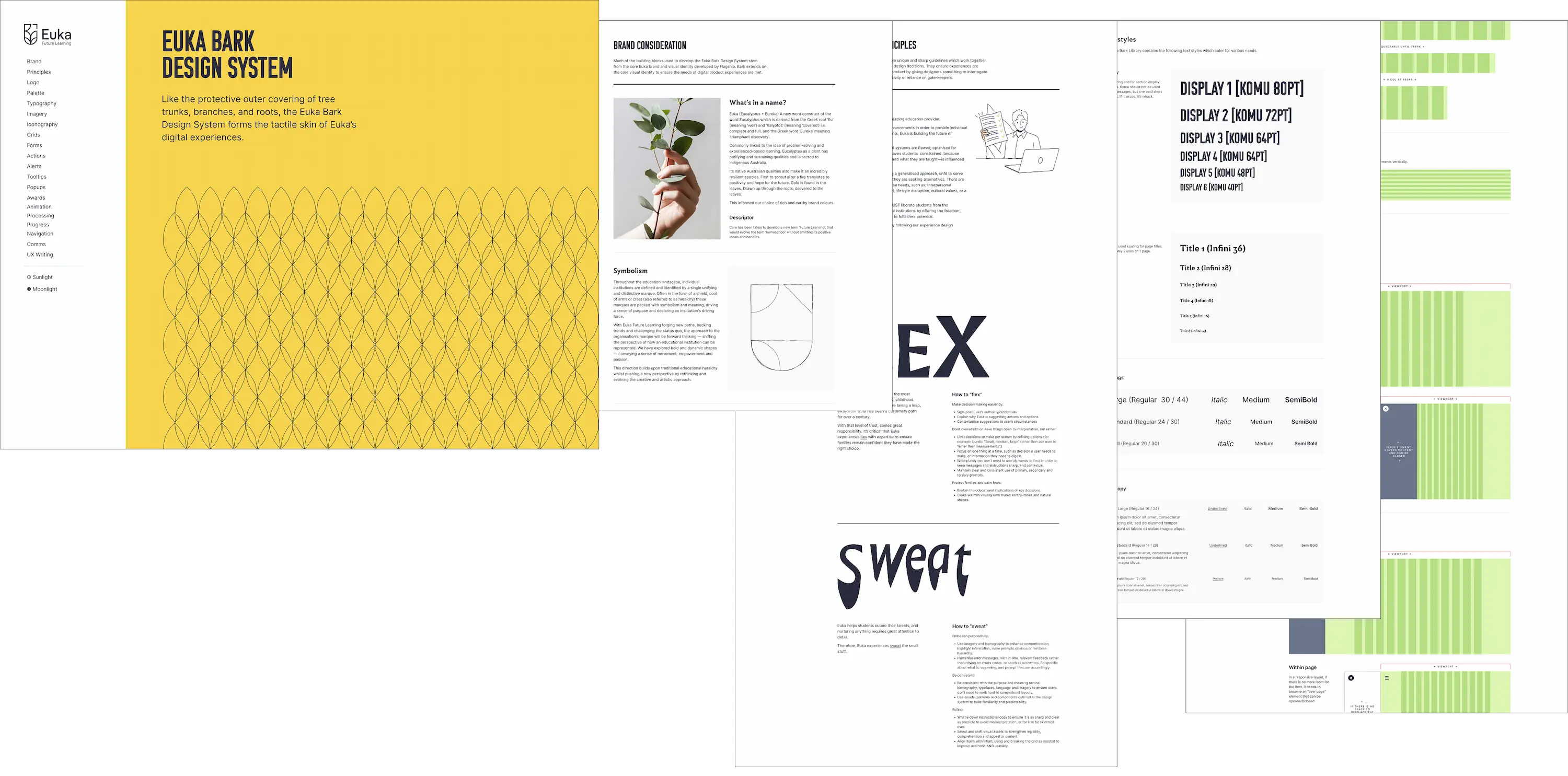
Euka Bark
Like the protective outer covering of tree trunks, branches, and roots, the Euka Bark Design System forms the tactile skin of Euka’s digital experiences.
Employer: Euka Future LearningRole:Product / Design Lead
Why?
Before the creation of Bark, Euka's design practices involved inefficient repetition, ad-hoc application of visual styles, and inconsistence interface patterns.
Euka Bark, like any good design systems provided; consistency, predictability, and efficiency through centralisation, and re-usability.
Design Principles
Experience design principles are unique and sharp guidelines which work together (with a little tension) to anchor design decisions. They ensure experiences are unique—and genuine—to the product by giving designers something to interrogate designs with, removing subjectivity or reliance on gate-keepers.
Documentation
The Design System documentation is built up as a Figma prototype, which leverages, demos, and contains all the core components, styles and variants. This file is importanted into Figma projects so that it.
Atomic structure
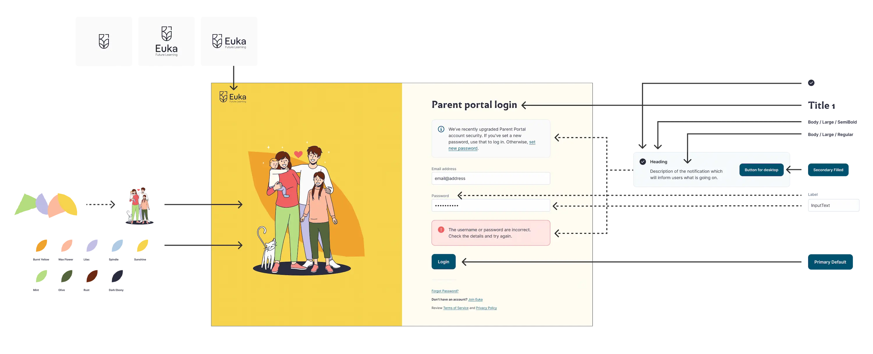
Euka Bark adopts an atomic design structure to ensure component re-use, and centralise control for managing changes.
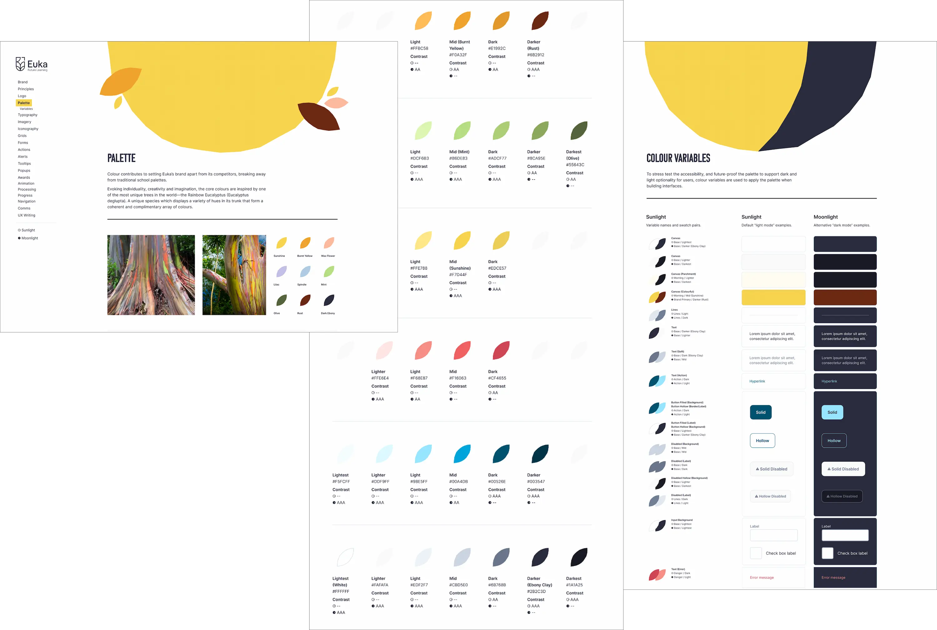
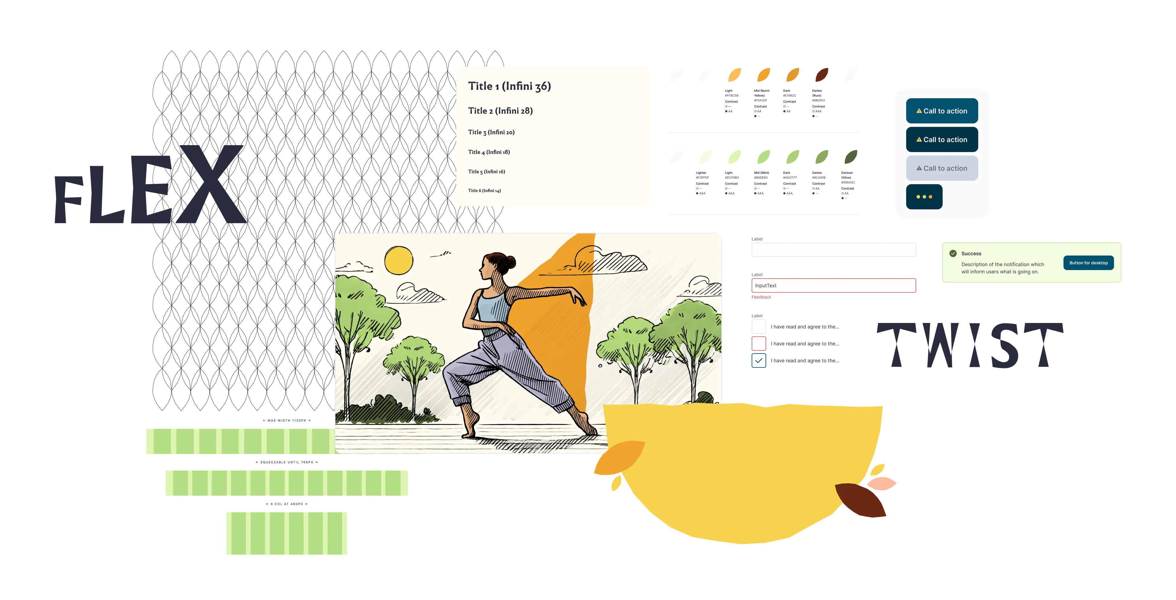
Palette
Colour contributes to setting Euka’s brand apart from its competitors, breaking away from traditional school palettes.
Evoking individuality, creativity and imagination, the core colours are inspired by one of the most unique trees in the world—the Rainbow Eucalyptus (Eucalyptus deglupta). A unique species which displays a variety of hues in its trunk that form a coherent and complimentary array of colours.
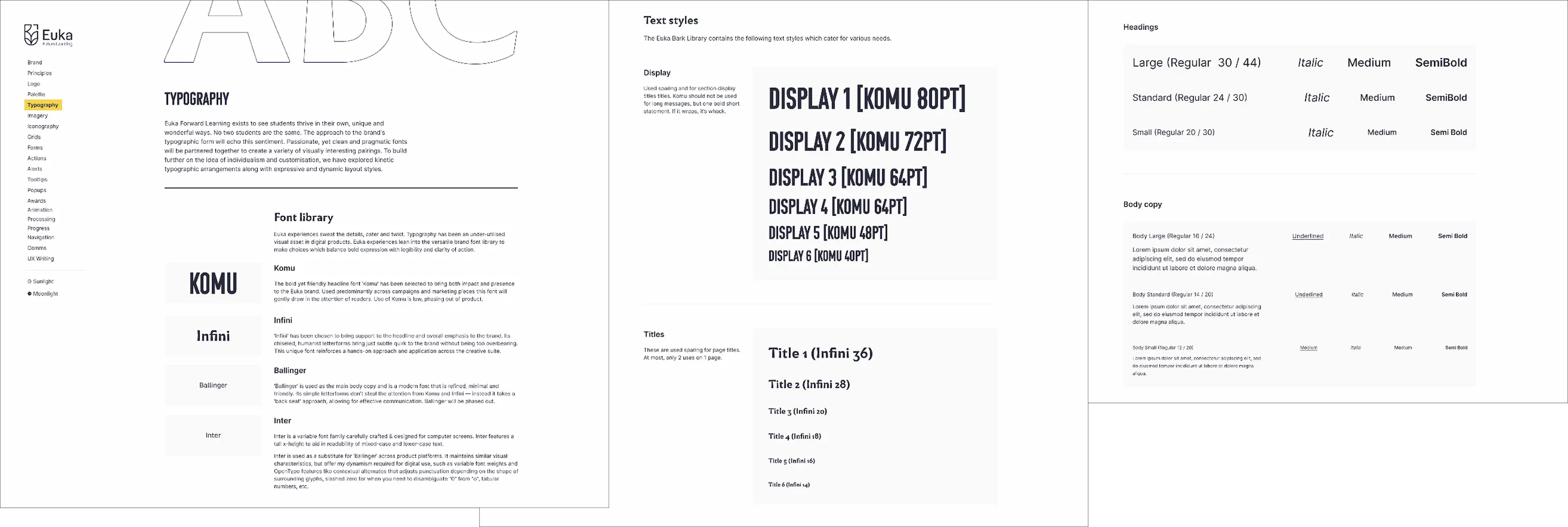
Typography
Euka Forward Learning exists to see students thrive in their own, unique and wonderful ways. No two students are the same. The approach to the brand's typographic form will echo this sentiment. Passionate, yet clean and pragmatic fonts will be partnered together to create a variety of visually interesting pairings. To build further on the idea of individualism and customisation, we have explored kinetic typographic arrangements along with expressive and dynamic layout styles.
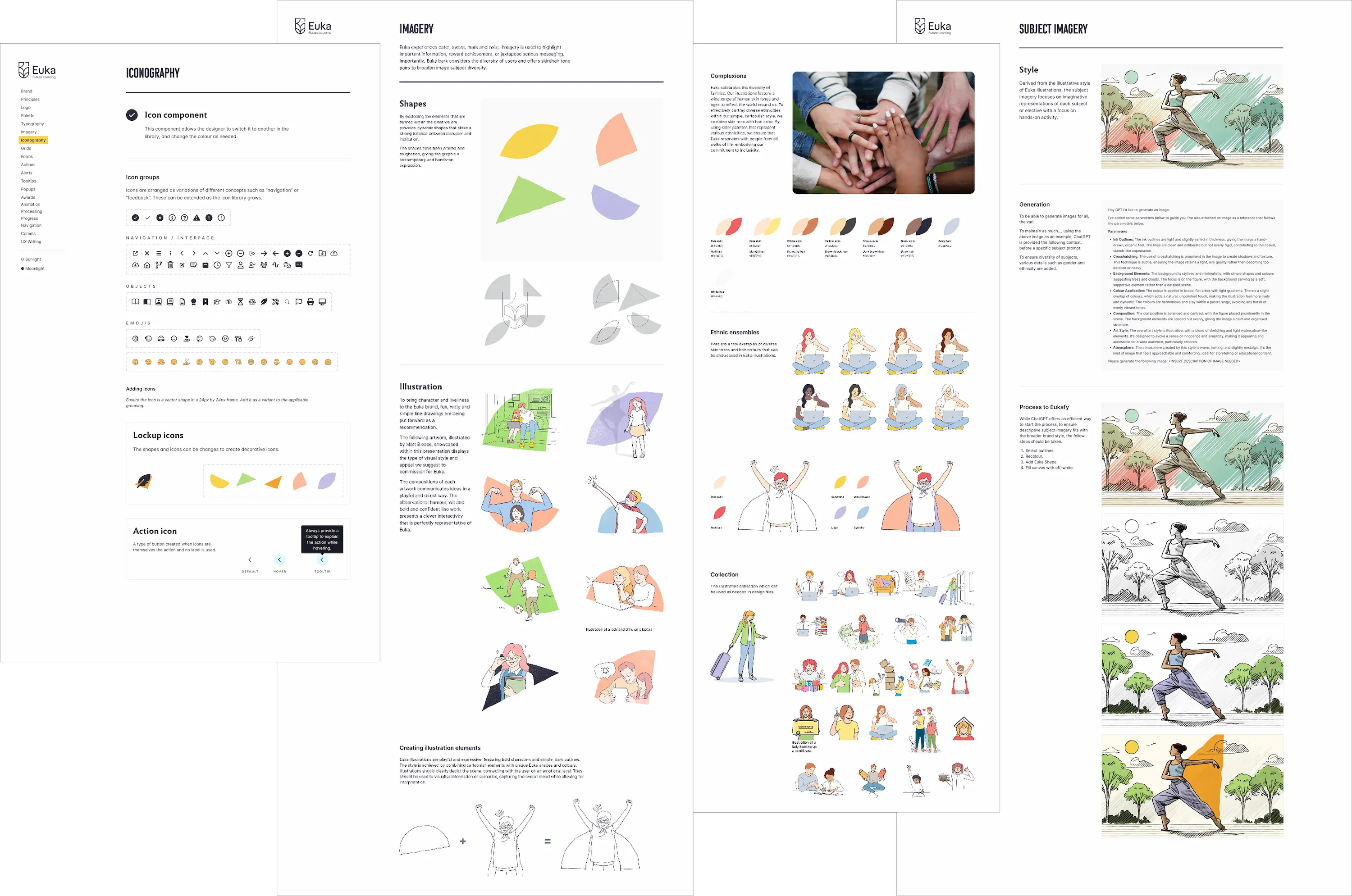
Iconography and imagery
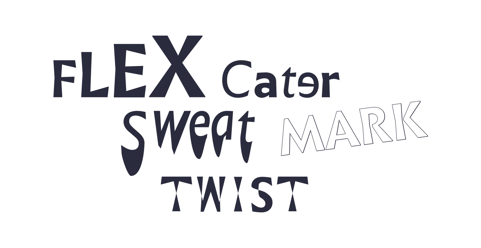
Euka experiences cater, sweat, mark and twist. Imagery is used to highlight important information, reward achievement, or juxtapose serious messaging. Importantly, Euka bark considers the diversity of users and offers skin/hair tone pairs to broaden image subject diversity.
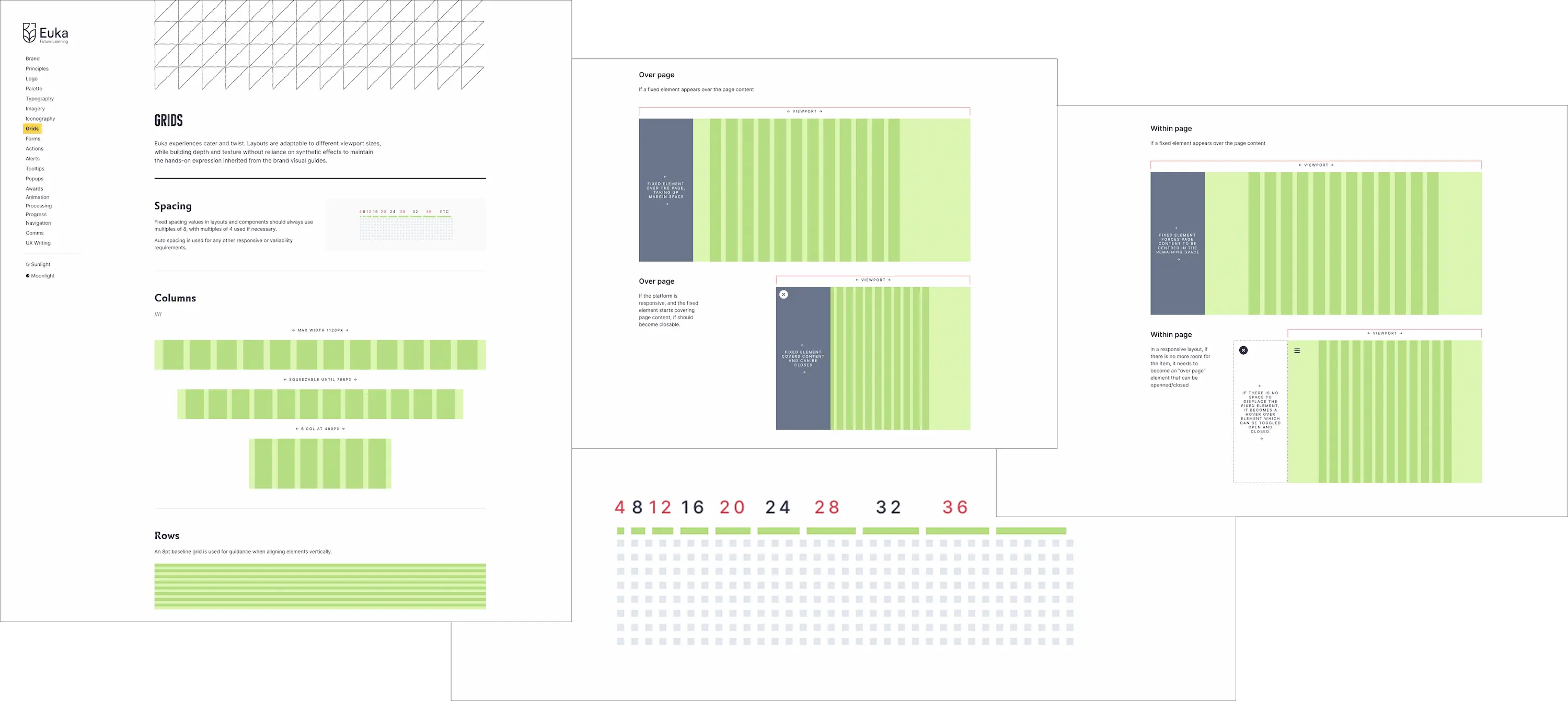
Grids
Euka experiences cater and twist. Layouts are adaptable to different viewport sizes, while building depth and texture without reliance on synthetic effects to maintain the hands-on expression inherited from the brand visual guides.
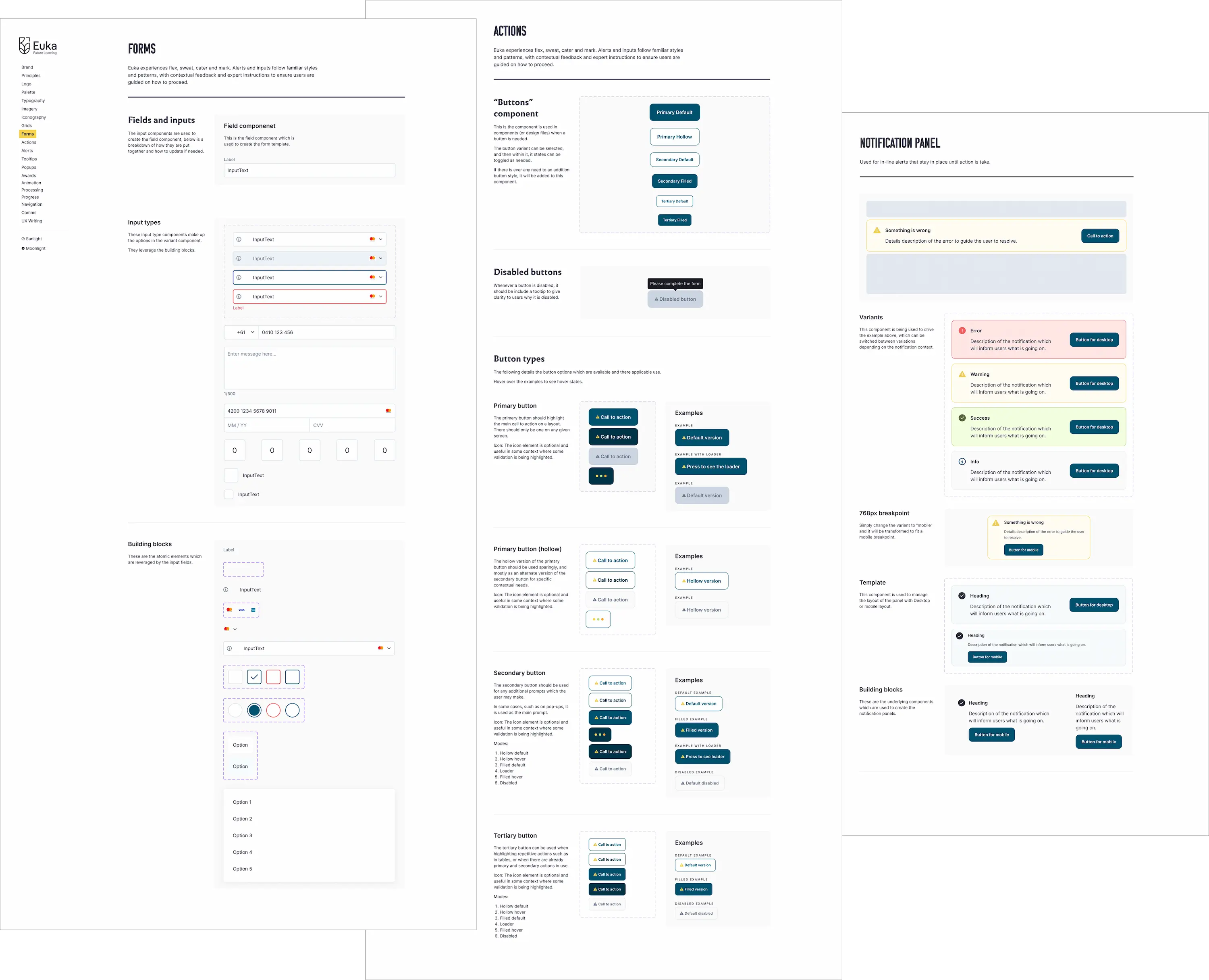
Forms
Euka experiences flex, sweat, cater and mark. Alerts and inputs follow familiar styles and patterns, with contextual feedback and expert instructions to ensure users are guided on how to proceed.
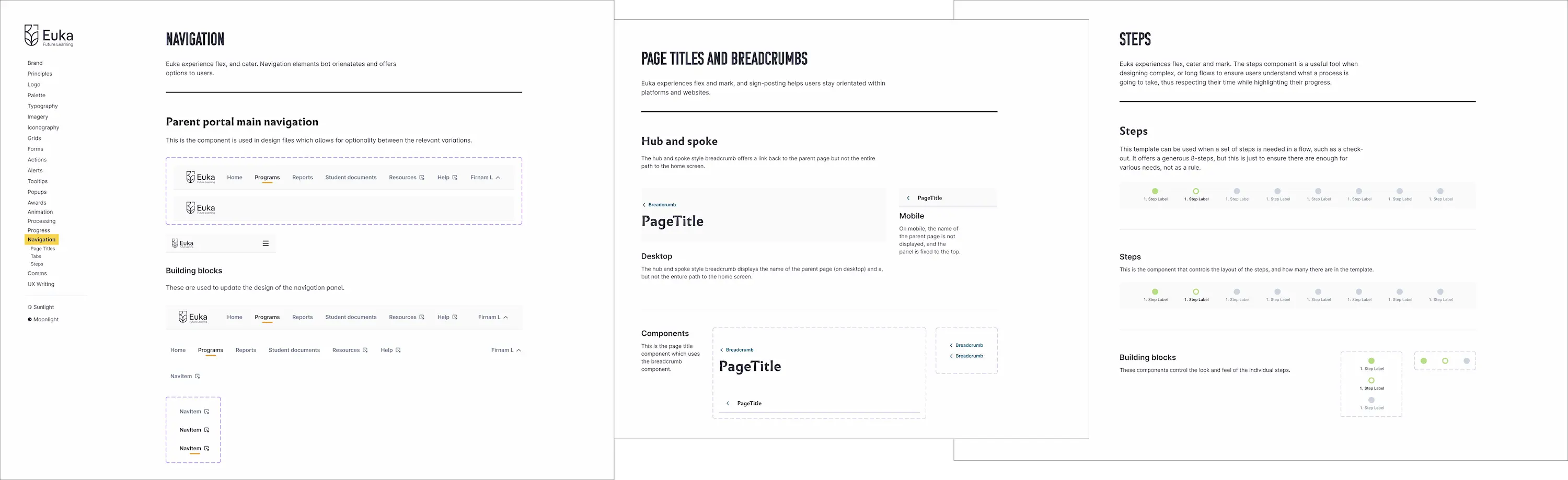
Navigation
Euka experience flex, and cater. Navigation elements bot orientates and offers options to users.
Layout containers
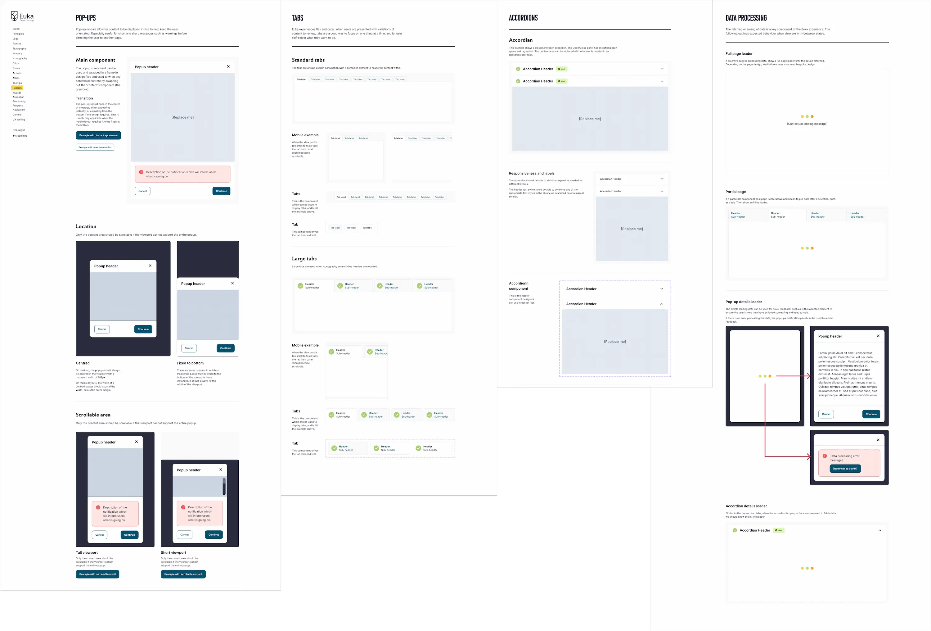
Pop-up modals, tab panels, and accordions allow for content to be displayed in-line, keeping users orientated.
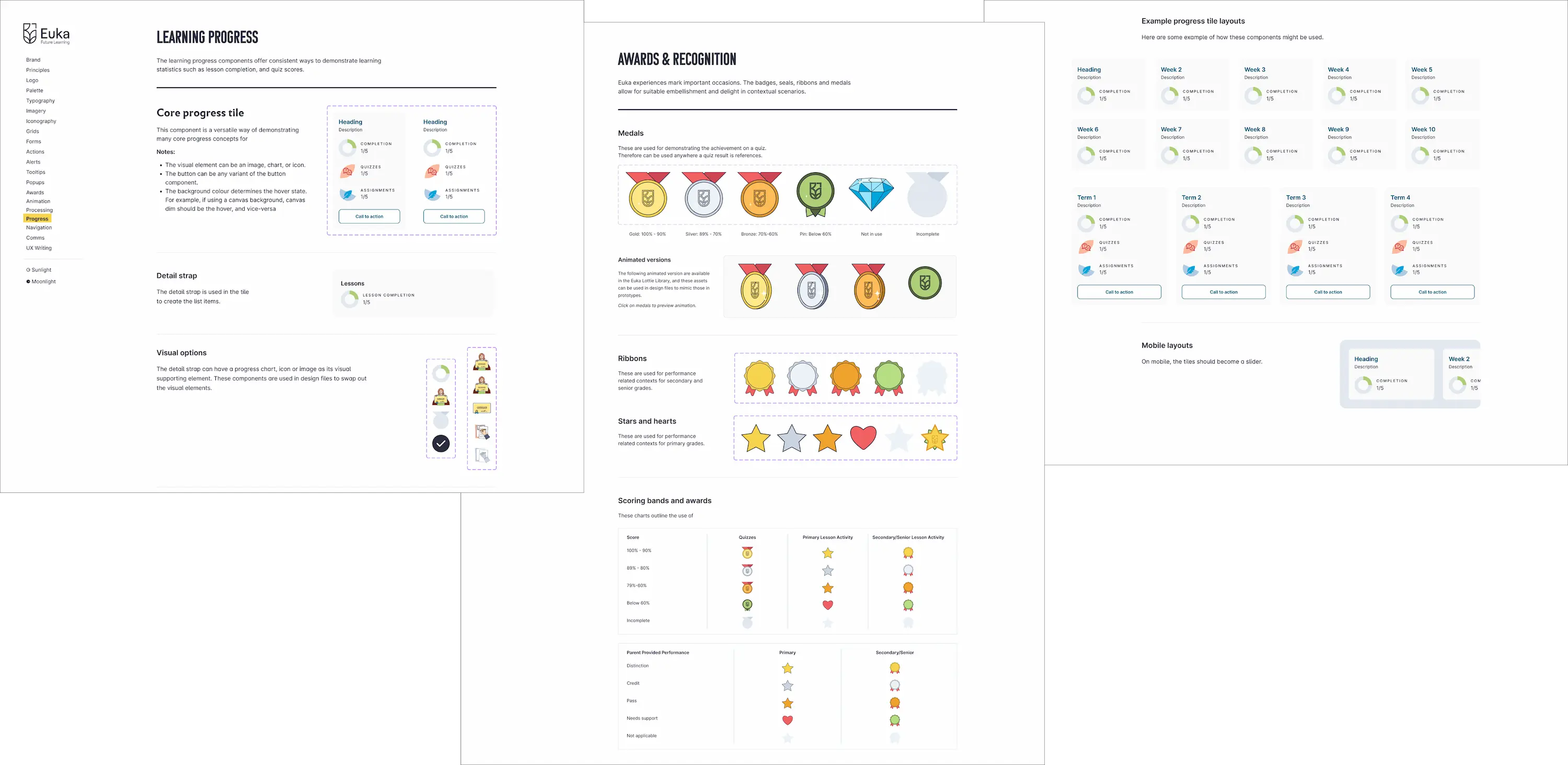
Progress
Euka experiences mark important occasions. The badges, seals, ribbons and medals allow for suitable embellishment and delight in contextual scenarios.
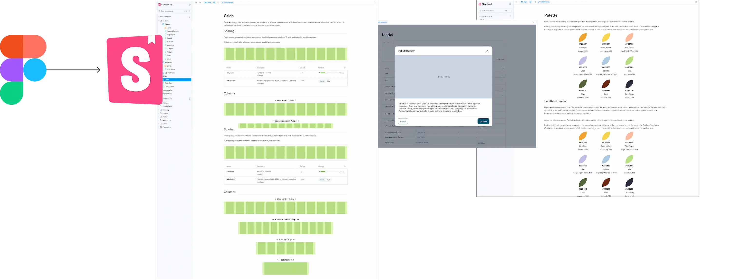
Storybook
Euka Bark is not just a tool for designers. The design assets in Figma, used for rapid UI creation, layed the foundation for a working component library created in the front-end workshop, Storybook. This has enabled efficient delivery of working software.
Lorenzo Princi
Software design leader—
Product strategy and experience