Redbelly Blocks
Design operations at Redbelly Network included the development of experience principles and a design system to ensure a consistent and efficient approach to solutions.
Employer: Redbelly NetworkRole: Senior Product Designer
Principles
Redbelly experiences must instil trust in the network to host and manage assets in regulated markets. The experience design principles offer a means to deliver on product values while ensuring those experiences maintain familiarity through consistent patterns across different elements, pages, devices and applications. Without defining principles, the design system risks being a general assortment of interface components.

Integrated
Redbelly product experiences demonstrate the connection between read-world entities and their on-chain counterpart or representation. They provide a sense of coherence, cohesion and consistency with different elements working together seamlessly.

Facilitatory
Redbelly product experiences help users access, manage and control their assets. They provide support, guidance and encouragement thereby making it as easy as possible for a user to achieve their goals.

Overt
Redbelly product experiences provide clarity about asset sovereignty and responsibility while demystifying web3 paradigms. They offer a sense of clarity and transparency to avoid misunderstandings or surprises.

Durable
Redbelly product experiences assure users that their that assets and transactions are safe and secure. They evoke a sense of stability and longevity to reassure users their high value assets are stored in an environment built to last.

Respectful
Redbelly product experiences are open to ALL types of users without discrimination. They give users a sense of validation and understanding by acknowledging their circumstances and preferences.

Approach
Atomic design is a methodology composed of five distinct stages working together to create interface design systems in a more deliberate and hierarchical manner.
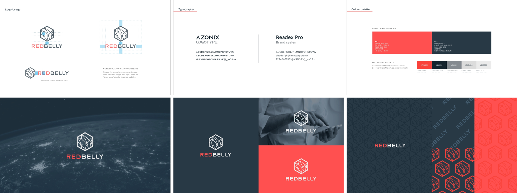
Building from the visual identity
The design system needed to be built upon a very lean visual style guide, mostly used to create corporate documents and marketing comms.
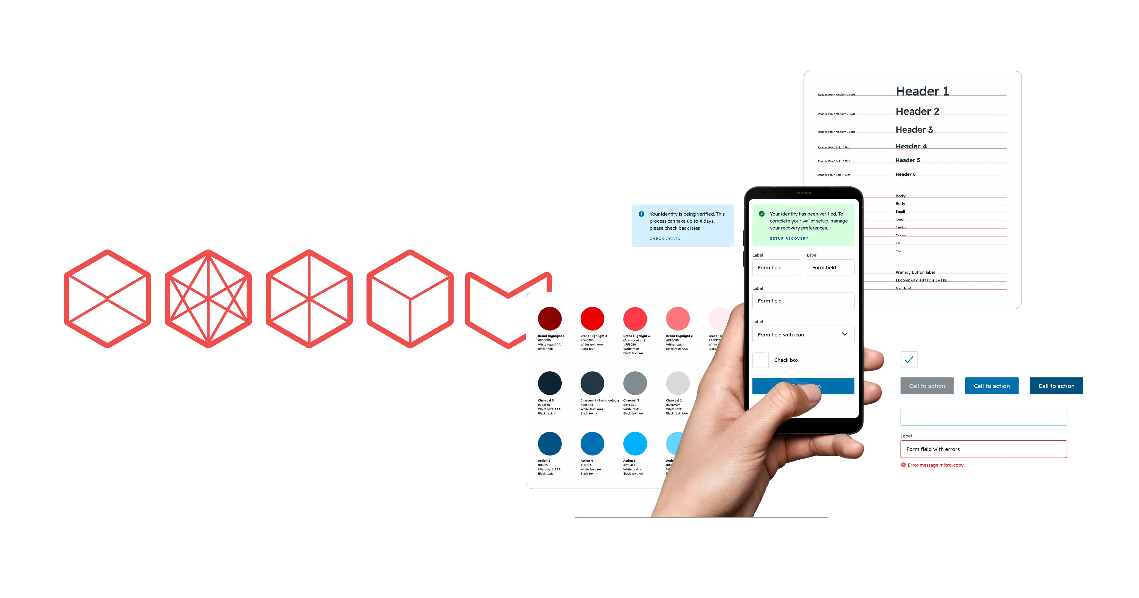
Documenting the design system
Design systems ensure scalability of design work but must be made to scale. Documenting the rules and guidelines was important to allow designers and developers to reference and adhere to the requirements of the interface elements as well as understand the rationale behind them. The implementation via Sketch Libraries and Symbols ensured the efficiency of its use across teams and update management of its elements.
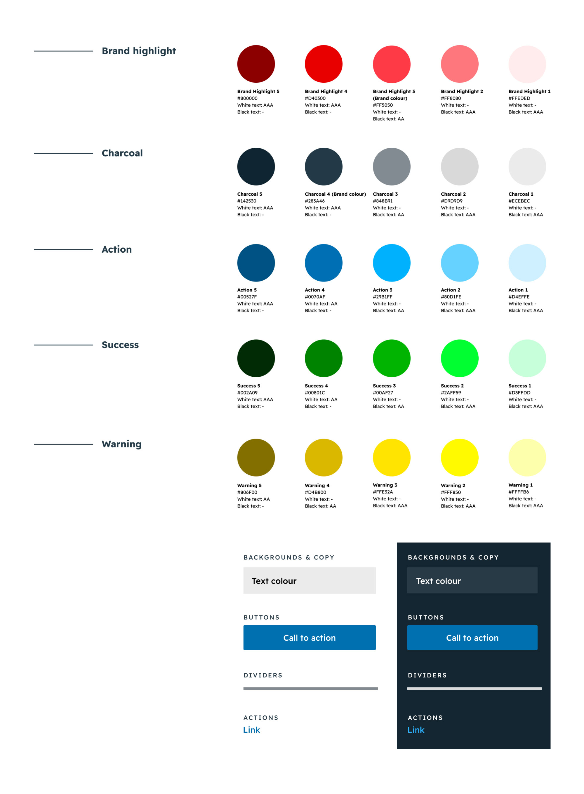
Palette
Redbelly experiences are respectful and overt. The expanded colour palette ensures accessible contrast can be applied between text and backgrounds, call to actions and other important feedback, alerts and notifiers. The palette also provides alternative colour variables which can apply when user preferences are set to light or dark modes.
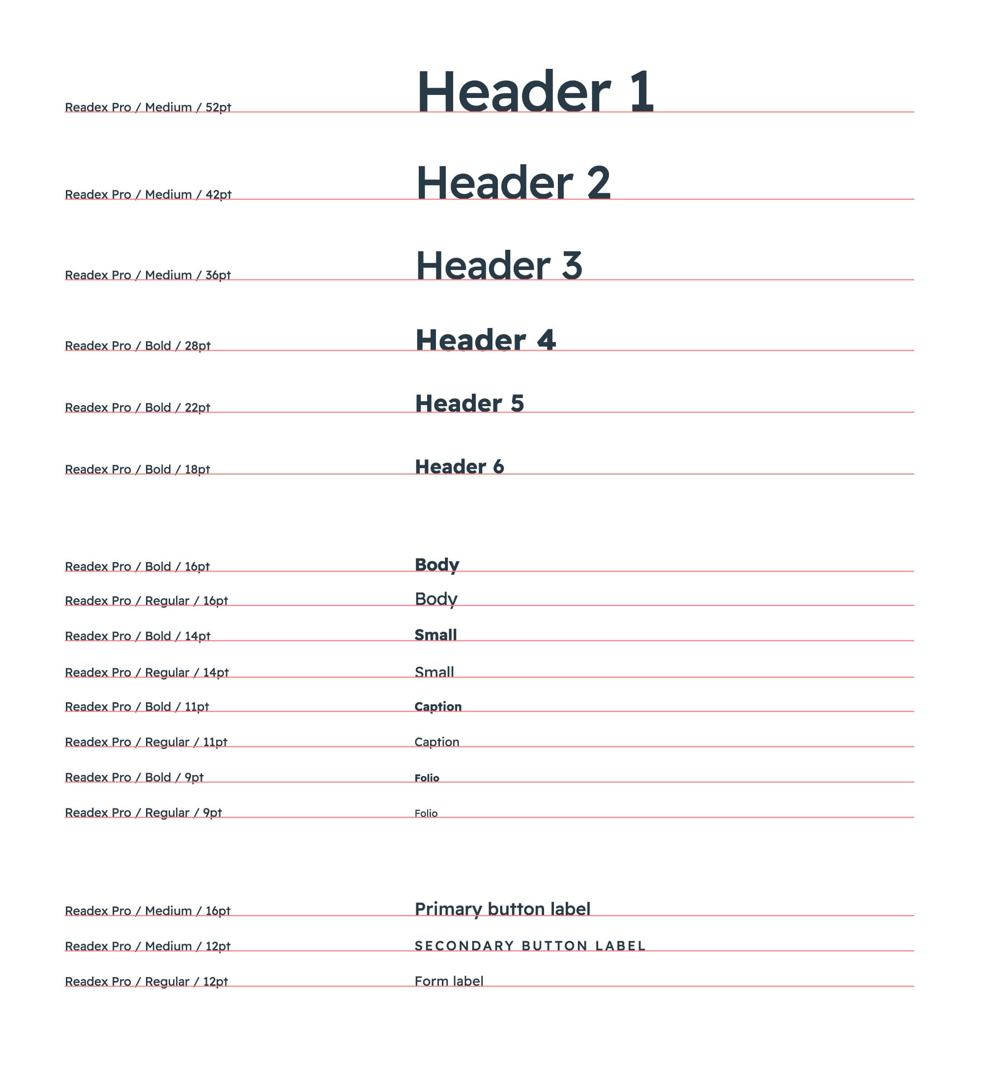
Typography
Redbelly experiences are overt and respectful. By using the font Readex Pro—which applies the Shaver-Troup Individually Optimal Text Formation Factors—we ensure copy is accessible to a broad range of readers. Designed by Thomas Jockin and Nadine Chahine, Readex Pro expands the Lexend type family (originally designed by Bonnie Shaver-Troup in 2001) which demonstrated immediate improvements in reading fluency among dyslexic readers when reading compared with other typefaces. Readex Pro brings the same accessibility from the Latin character set to Arabic script, which was added by Nadine Chanine in July of 2021.
Iconography
Redbelly experiences are overt and durable. The Ionicons “Sharp” library is a rich resource of iconography which evokes these themes with thick sharp lines and solid fills.
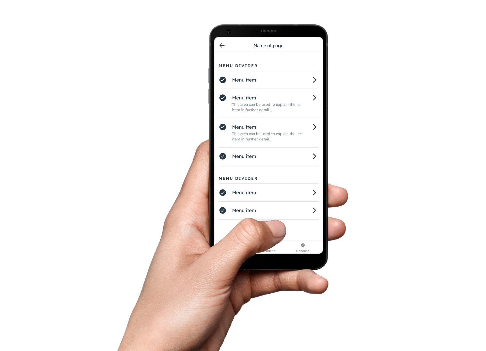
Navigation
Redbelly experiences are overt and facilitatory. They follow conventional navigation and selection paradigms with descriptions and iconography to boost comprehension.
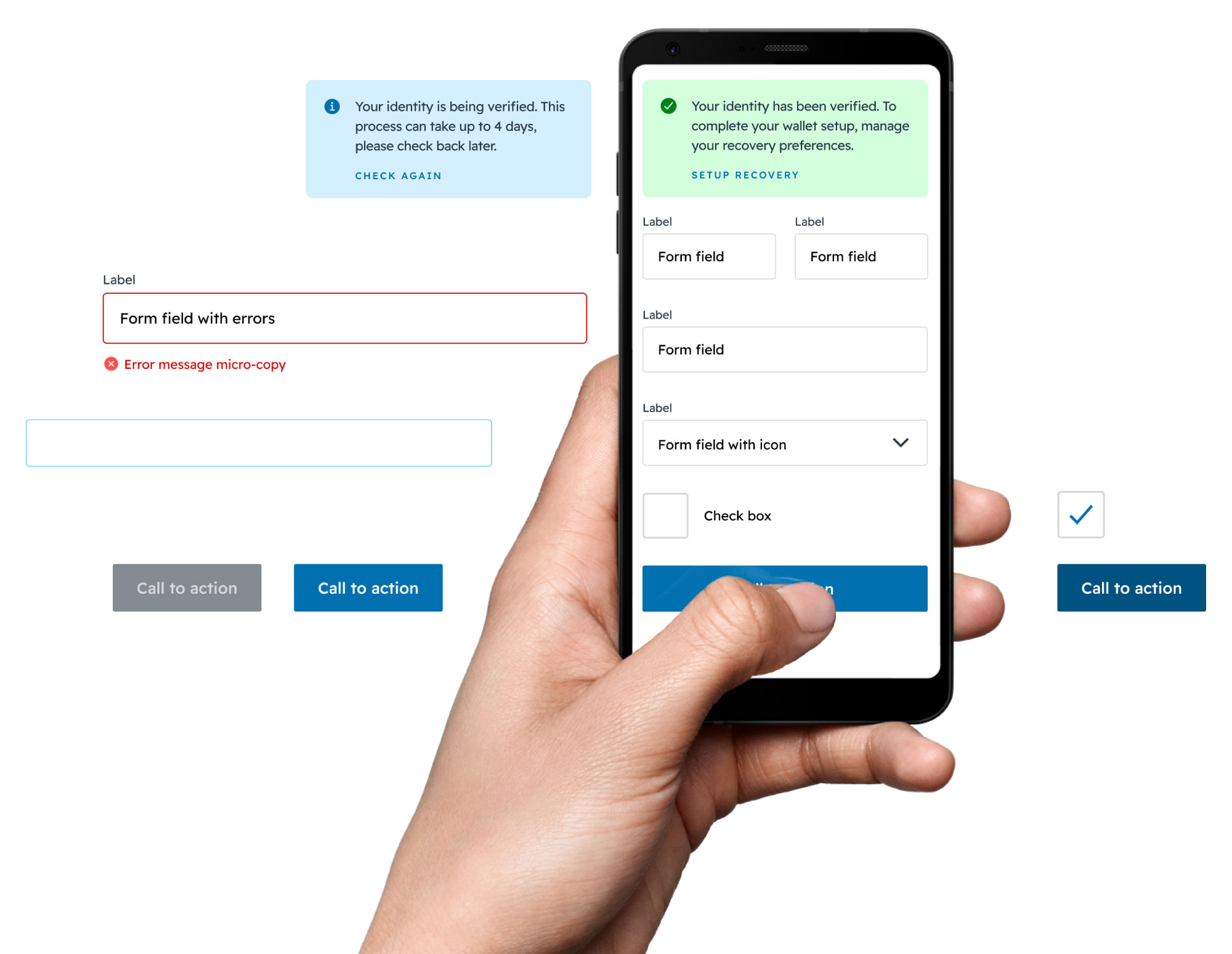
Inputs and notifiers
Redbelly experiences are overt and facilitatory. They follow familiar input mechanisms with validation to offer users guidance, feedback and understanding.

Feedback
Redbelly experiences are durable and integrated. Loading animations and other indicators provide feedback to reassure users the system is working and things are happening to fulfil their needs.
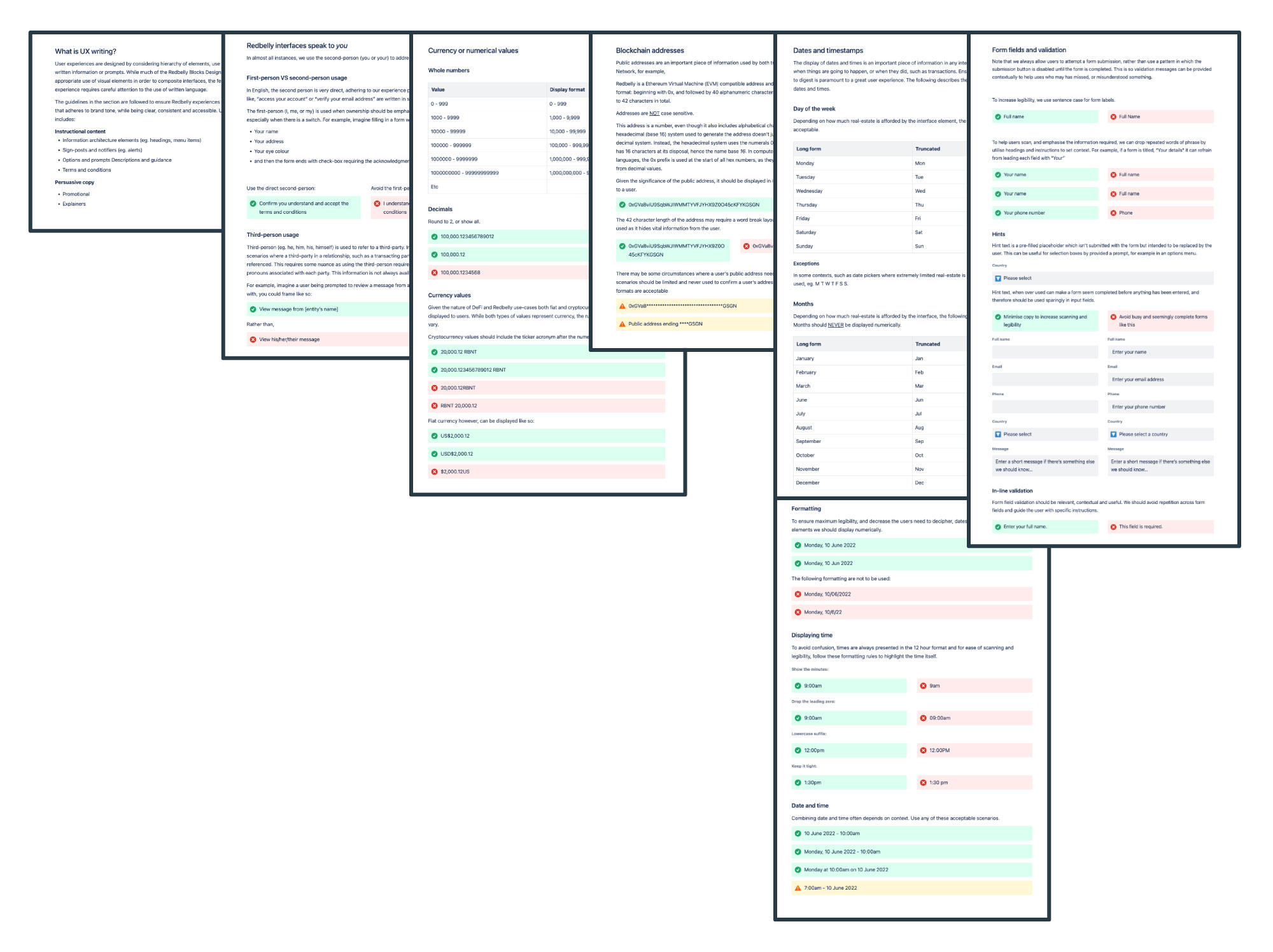
UX Writing
Redbelly experiences are overt and facilitatory. Effective copywriting provides the best means for communicating in a way that provides clarity of instruction and transparency of information to users, thus limiting misunderstanding and mistakes.
Aligning UX copy to design principles
User experience writing supports user journeys. Our goal isn't for user to read our software, it is to assist them complete their goals. Copywriting is therefore not a seperate considering from the overall design, and as with any interface element, should work in accordance with the product design principles.

Integrated
Redbelly Network bridges real-world assets with on-chain counterparts. To ensure on and off chain connection is maintained, terminology should remained consistant with the taxonomy users are familiar with in the real-world of finance. Any Web3 concepts that don't have a real-world equivalent phrase, should be defined for the user.

Facilitatory
Copy should assist users complete their taks with a focus on communicating the essentials. Therefore, Redbelly experiences make things evident; starting with a need and offering an applicaple path toward the outcome. When writing copy, as much as possible, we aim to be direct, succinct, accurate and informative as we provide relevant options, prompts and calls to action. Thereby, we ensure users are guided toward the completion of intended tasks.

Overt
At Redbelly, we want to enable users by offering various journeys which suit their needs while we avoid misunderstanding or surprise. There, we provide distinct definitions for any options we offer, as well as relay their conditions.

Durable
Redbelly experiences provide confirmation for actions taken, explain unexpected happenings, and prompt users to identify or resolves errors and warnings. For example, if a user encounters a 404 error, we might say, "Sorry, it seems that the page no longer exists. Visit our homepage." Rather than, "Error: 404".

Respectful
Redbelly interfaces are used by a diverse user base, therefore, we keep language as simple as possible, and retain consistent terminology. When addressing users, we do so without making assumptions in relation to their profile, needs, or circumstances.